Difference between revisions of "Terrain in The Last Of Us"
m (Cman2k moved page TheLastOfUsTerrain to Terrain in The Last Of Us: improved formatting) |
m |
||
| Line 1: | Line 1: | ||
| − | |||
| − | |||
Excerpts from the Polycount forum thread [http://www.polycount.com/forum/showthread.php?t=122359 The Last of Us Art dump / Rogelio Olguin]. | Excerpts from the Polycount forum thread [http://www.polycount.com/forum/showthread.php?t=122359 The Last of Us Art dump / Rogelio Olguin]. | ||
Revision as of 04:58, 24 November 2014
Excerpts from the Polycount forum thread The Last of Us Art dump / Rogelio Olguin.


Rogelio 'rogelio' Olguin says:
Terrain was hand sculpted or poly modeled. We do not have a terrain editor like udk or cryengine. All of our terrain is hand sculpted, and in this case I do not think a terrain editor like UDK or cryengine would get the look we were going for. This area had around 5 different revisions on the art look because we really wanted to hone into the look some revisions being drastic some others being smaller.
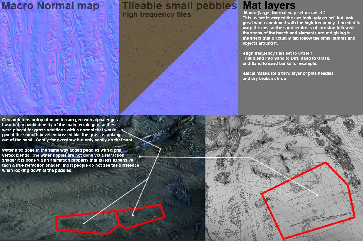
The rock formations are zbrushed with large to medium form detail than use a second uvset for tiled textures ontop blended to create cracks or smooth areas. This is presented pretty much the same in the udk sample level with the rock formation it is pretty much the same idea.
The terrain has several blended materials each blend goes into two main material types than a decal so for example
- sand to rock (decal broken wood pine bits) Large normal macro map
- sand to bank sand (same decal as above) Large normal macro map
- etc
Materials are placed on sections of where I want those blends and than vertex blend them in. Nothing fancy really just basic blending.
One thing I hold true is that one texture will not make things look awesome. Imo well balanced shaders will. I think we are starting to move away from this one texture looks sick. Like the below textures are kind of boring alone but together it looks sweet. I really do not think anything we did in ND is "special" it just well balanced from good forms and composition (Modeling) to materials treatments (texturing)
Below is an explanation of it of the sand blends.
Macro map was done in photoshop mostly I made a couple of random white strokes and black strokes than grabbed the smudge tool and bingo done in like 10 mins or so. Oh one piece of advice the longest route is not the best one. Some people would say sculpt that. I guess I am slightly old school if you can make a good bump map you can make a good normal ;)

All textures are set to 512x512 or less Texture streaming works better at this size. Some rare cases I made some 1024x1024.
These sculpts are not completely 100% tile-able right from the get go. I have to tile them in photoshop still.
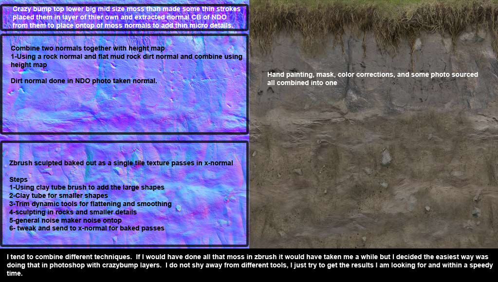
As for sculpting these I used basic brushes clay tube, Trim dynamic, Flatten, Standard, and others... but yeah pretty basic nothing too fancy. And the mat cap is just the standard mat caps. I tend to keep my programs stock and clean from extra plugins unless it starts to become a standard used thing. This helps for two reasons new plugins tend to make programs unstable and if I move to another company and that company does not have the fancy stuff well I know the main program. I tend to do this with most programs keep them stock. Many people add new plugins or scripts that is fine but I have seen very few scripts that actually improve my work follow significantly for it to be justified to be installed etc, again if starts to become a standard tool that is a different.
The blends are done with vertex maps and masks/height maps within the shader. the only thing special was the large macro map set on different uv set.
Sometimes I start with a displacement map quickly grabbed from sourced image from cgtextures dumped into crazybump and xulpted further and sometimes I start with a full on sculpt by hand from nothing. Just whatever is needed. Basically I try to find the quickest way to the result.
Most brick buildings are done via vertex blends. About the distant buildings in the beach level that is matte painting placed on a 3d geo to give it some parallax.

Break down of of first rock sculpt.
- First did a flat concept of this to know it would tile in photoshop.
- did some basic height map treatment in photoshop of what I wanted and put through crazybump did a horrible looking crazybump displacement and sent into zbrush.
- displaced it looked horrible but I used it as a general guide of where to sculpt.
- used large clay tube brush
- trim dynamic
- sculpted mid details
- than small details
- than a general noise on top with either alpha masks or noise maker.
Most are sculpted this way. The rocks and mud are mostly 100% sculpted really the initial displacement was a guide it looks nothing like the horrible displacement.
As for the material It is just a normal mat from zbrush nothing special, I think I moved the light a bit before rendering but that was it. even the render settings are the same when you start up zbrush.
(in reply to an explanation of how to blend macro and micro textures): the only other difference is warping the uvs to give them directions of where those erosion went. Try selecting a couple points and do a soft selection in the uv editor rotate and warp it and see the results.