Difference between revisions of "Roguedevelopmentdiary"
EricChadwick (Talk | contribs) (Restored the images.) |
EricChadwick (Talk | contribs) (TOC under title) |
||
| (2 intermediate revisions by the same user not shown) | |||
| Line 2: | Line 2: | ||
Tutorial by [http://crazyferretstudios.com/ Lee 'almighty_gir' Devonald] | Tutorial by [http://crazyferretstudios.com/ Lee 'almighty_gir' Devonald] | ||
| − | + | __TOC__ | |
== Week 1 == | == Week 1 == | ||
| Line 99: | Line 99: | ||
=== The Freebees! === | === The Freebees! === | ||
| − | Please feel free to download any of the following base meshes: | + | Please feel free to download any of the following [[BaseMesh|base meshes]]: |
* [[file:heroic_female_obj.rar]] | * [[file:heroic_female_obj.rar]] | ||
| Line 240: | Line 240: | ||
here's an image of what I tried to accomplish. | here's an image of what I tried to accomplish. | ||
| − | [[image: | + | [[image:torso_analysis_3.gif|frame|left|Analysis of torso in zBrush. Image by [http://crazyferretstudios.com/ Lee 'almighty_gir' Devonald].]]<br clear="all"/> |
| Line 331: | Line 331: | ||
[[image:Rogue_final_wire.jpg|frame|left|Final render of Rogue with wires. Image by [http://crazyferretstudios.com/ Lee 'almighty_gir' Devonald].]]<br clear="all"/> | [[image:Rogue_final_wire.jpg|frame|left|Final render of Rogue with wires. Image by [http://crazyferretstudios.com/ Lee 'almighty_gir' Devonald].]]<br clear="all"/> | ||
| + | |||
| + | ---- | ||
| + | [[Category:CharacterModeling]] | ||
Latest revision as of 21:42, 23 November 2014
Rogue Development Diary
Tutorial by Lee 'almighty_gir' Devonald
Contents
Week 1
Week one started with a bang. We all got together on Google+ (something I was sceptical about... I’m not a social networking fan) but actually it has some AMAZING features. Screen sharing is just mindblowingly fantastic even if it’s in its infancy and lacks some features. I’d strongly recommend it to anyone considering a collaborative project.
This week consists of choosing our girl, collecting reference, and... Drawing. Emphasis here on drawing. I’m not a fan at all; I think I suck at drawing which makes me not want to draw which has led to it being a self fulfilled prophecy! I don’t practice because I think I suck and because I don’t practice I DO suck! But that’s okay! This isn’t a drawing master class and truth be told I totally understand the reasoning behind the drawing part of this exercise.
When top artists tell you to try drawing your subject before you model them it’s to help you become more intimate with the subject, to see it from more angles than you may already have and more importantly it actually helps you to find out things you might have missed at a cursory glance. There are quite a few things I picked up drawing Rogue that I would have missed if I didn’t do it. The relationship between the shoulders and hips, the elongation of the torso... these are things you can make a guess at by looking at pictures, but when you start to draw the character you quickly understand how they’re exaggerated, and how easy it would be to go too far and make it all wrong!
It’s at this point I’m going to introduce you guys to a couple of things. I don’t really have a massive concept bible. Instead I focused on a single fantastic reference. This would be my primary sheet, the one I use when all else fails.
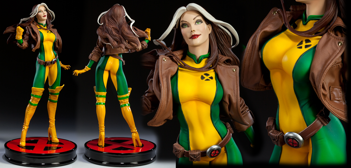
Once I had put together the bible reference I started out on secondary reference. This would be fan art or other secondary sources that I thought were good reflections of the character. In some cases this even included real people’s faces, hips, chests etc. All things I felt would be good to use in building the model, things that screamed “sexy”, or things that really spoke to the character of rogue... the mischievous southern belle, cursed to love from a distance, that fierce and eternal tease. And finally it included any and all of the sketches and drawings I did, yes I’m aware they’re horrible! But it’s spurred me into wanting to do more drawing which is a good thing.
I’ve decided to upload the secondary bible in a .psd file, I think it’s important that you guys see how I built up the sketches (and help me do it better). I started by doing a block out stage, where I focused on main body shapes... the hips, ribcage etc.
The Sketching!
An important note here is that I actually did my orthos first... and that’s a mistake! There’s a lot missing from the orthos. They lack character, and in a lot of places they seem to lack all of the things I learned from doing all of the other sketches. They also weren’t as good! After sketching as much as I did for the rest of the sheet I’d gotten into a much better flow, and by comparison the orthos were just bad! But that’s part of the point of this course, to learn and do better next time. Here’s how I went about the sketches
- Start out by gathering reference, scatter it across your drawing space, or put it to the top or one of the sides. But most importantly make sure it’s always visible!
- Block out your character, my blockout is in red. You can see I focused on basic shapes. A cylinder for limbs, very blocky shapes for the ribs and hips, and the head is made with a circle plus a blocky piece for the jaw.
- Use guidelines with your blockout... try to keep those sexy curves in there, let your blockouts follow those curves!
- Sketch over your blockouts... it doesn’t have to follow the blockout 100% in fact if it does you’re probably doing it wrong... remember that there are organs and muscles present that aren’t there in the blockout, the skin goes around those!
- Analyse your sketches guys! This is super important. As much as it’s good to get external feedback, make sure you’re learning from your own work! By analysing, you can tell yourself “okay, this part is important to get right...” and it will help other people spot things you might have missed.
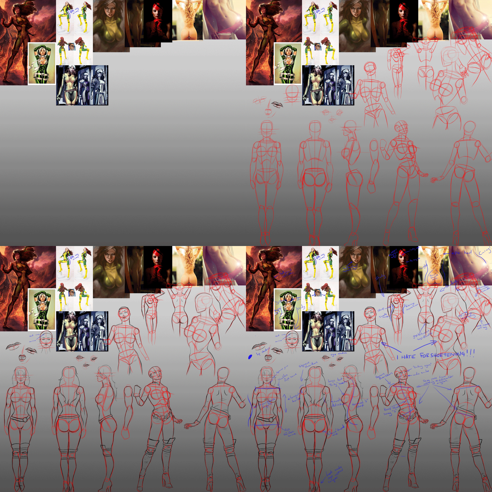
The Analysis
Analysis is important here. I wasn’t just looking at women (although that’s important); I was finding the differences between real women and marvel comics women...
- Real women tend to be around 6.5 - 7 heads tall.
- Marvel women tend to be around 8 heads tall.
- Real women have shorter waists than marvel women which make them appear a little broader.
- Marvel women have elongated waists, which makes them appear slimmer... they aren’t ACTUALLY slimmer; they just appear that way due to the elongation.
- Real women have “soft” features, soft jaw lines, delicate shoulders, and some “bubbling” at the waist/hip area.
- Marvel women have “harder” features, almost masculine jaw lines, broader faces, square shoulders, and curvier waist/hip transitions.
It’s also important to note certain anatomical things... most of you probably know them, but for those who don’t, here are some of the things I picked out. When a leg bends, the hip doesn’t... bear this in mind when rigging especially. It also creates a subtle “seam” on the body, which is an inch or two below the natural seam from the iliac crest and the crotch.
- When the leg bends, the arse cheek follows (see right hand sketch/analysis).
- There are living people with almost super hero proportions... find them and use it to your advantage!
- Breasts hang... even the small ones have gravity against them. This leads to a sometimes subtle natural seam beneath them. Pay attention to it as if you get it wrong it will make the girl look masculine!
- Breasts themselves add another curve to the body, they are ROUND, if you want to study the shape of a breast and don’t have a girlfriend, or your parents think you’re looking at rude images... try filling a balloon with water and hanging it against something to see how it hangs.
- Arses come in all shapes and sizes, sure my character has a heart shaped arse, but yours might not. Pay attention to what makes your characters arse special! Some women can be identified by their arse alone... it’s as important as the hands or the face!
- Remember, skin is like Clingfilm... it might occasionally form a natural concave, but more often than not it will simply stretch over a hole or gap. This is especially evident at the abdomen.
Week 2
Now, the course at this point takes a wider scope... weeks 2, 3, and 4 are actually joined at the hip. They focus on making a base mesh, blocking out, and sculpting.
I built a base mesh during week 1, while sketching. I wanted to stay a little ahead of the curve if possible, and I LOVE sculpting. So getting into that part of it as early as possible was a must for me.
Anyway! Rambling aside this is how I went about building my base mesh.
The Head
I wanted to keep it quads where possible. This is a good rule to follow when you’re looking at sculpting, too many triangles and even too many “poles” (vertices which share more than four faces) can give you an inconsistent smoothing result which is obviously not a good thing. That said, my mesh has a couple of poles here and there, and two triangles... well, two in “prominent locations” anyway.
I had originally intended the head of the mesh to be as plain as possible... pretty much a subdivided cube attached to a neck. But then I also wanted to practice my topology, so ended up making a head with edge loops and such. No truly defined features where possible, but still decent topology. So when making the head I focused hard on clearly defining these loops:
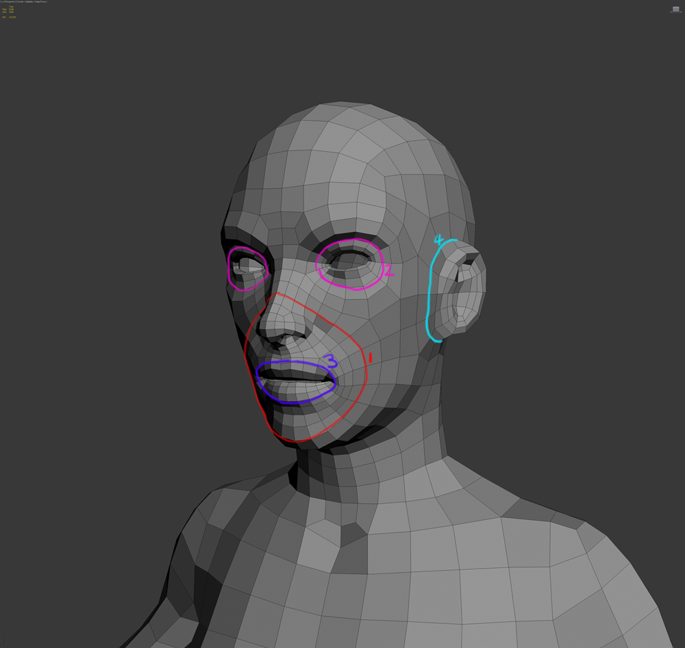
- Creating a nice strong loop from just above the nostril, to the chin, this goes around the mouth completely. If you want to know why, go look in the mirror and open your mouth as wide as you can. You’ll see the line I’m talking about!
- Creating loops around the eyes can “seem” like a pain, but only if you’re trying to force detail in. Remember this mesh is for sculpting... vertices will get pulled and pushed around all over the place. As long as your topology is nice and clean, it will hold up in your sculpt. It’s easier to move a vertex into a new position while maintaining your good loop structure, than it is to have to deal with bad topology and the sculpting issues that follow.
- Nice loops around the lips. Remember that the lips do NOT end in a point at their corners, when the mouth is open it should make a nice O shape, no poles, no triangles, and no excuses!
- Some nice loops around the ear can’t hurt. They help to support a nice even topology within the ear itself. This is one area of my base mesh where anatomy is almost entirely forgotten in favour of even topology... I’d rather sculpt the inner ear completely than try to model it and have to worry about topology.
Hopefully if you’re looking to build a base mesh and you keep these things in mind, you’ll have a finished product that will hold up well in sculpting, and will serve as a half decent guide at the same time. Remember that a lot of these loops are placed according to muscle structure, so when you come to sculpting you’ll find less resistance along those lines, and more resistance along lines which aren’t supported anatomically.
The Body
Here is where things can be quite interesting. I decided to keep a largely even polygon distribution so as to make sculpting easier, but at the same time try to include loops around areas which would have naturally high definition.
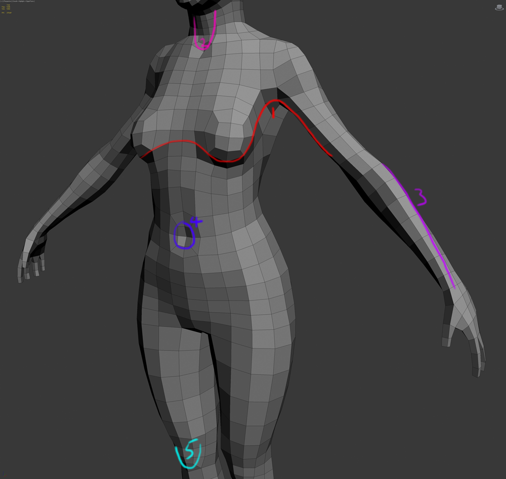
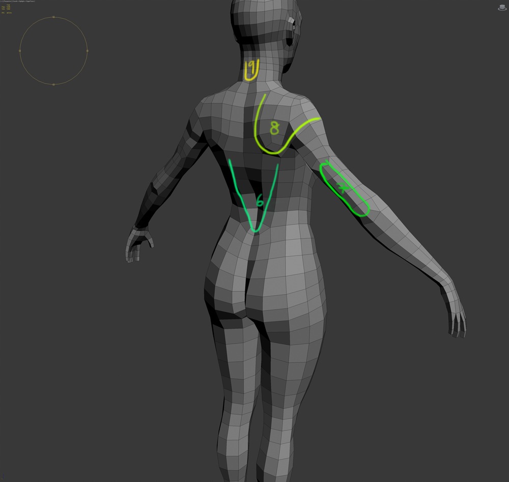
- Pectoral – Bicep transition. This line would be present in a male character and in actuality, would be far easier to produce. But alas, women have breasts, and in this case they got in the way somewhat! The line would normally trace the lowest part of the pectoral, up to the deltoid, and down the bicep. But in the case of a woman I thought it should trace naturally around the breast instead of the pectoral. Notice also how the breast is largely formed of a sphere and merged into the topology of the chest.
- A clear area of definition for high definition is the connection of the neck muscles to the clavicles. The clavicles themselves tend to be fairly well defined on slim and muscular people, but the neck muscles themselves can tend to protrude slightly.
- Twisting the edges from the elbow to the wrist can really help when it comes to sculpting the arm muscles. They naturally twist this direction on the forearm which can help reduce resistance when sculpting.
- Belly button! An entirely optional thing. It can really help to find the “centre” of your character by defining their belly early on.
- Defining the knee like this can be very helpful, like the belly button it is a natural centre for the legs and is one of the most defined areas on the human body.
- Here’s another area where you can keep a fairly even polygon distribution but also help to define a muscle group; this one is the transition between the latissimus dorsi and the trapezius.
- Depending on how well defined you want your character; this set of loops can really help sell the triceps, the humorous, and the elbow.
- This loop is introduced to help define the shoulder blade (scapula).
- This loop serves a dual purpose. Firstly it forms a great terminator for an edge loop that comes over the top of the skull... there were just too many loops to let them go across the body! And secondly it allows for definition of the neck muscles.
As you can see, I put some effort into keeping as even a distribution as possible, whilst trying to define some key areas.
The Zbrush
And the final stage was to create suitable polygroups in Zbrush.
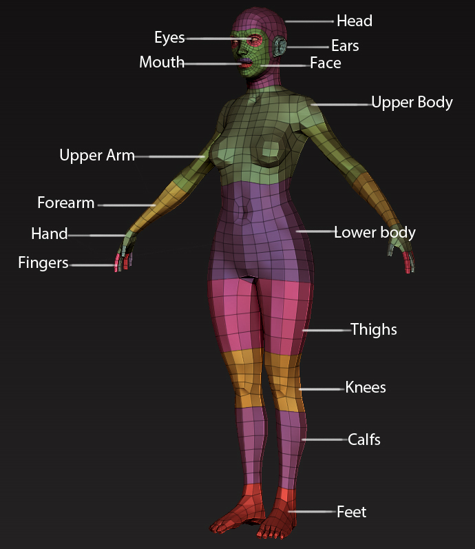
The polygroups include everything I could see becoming a problem area, or an area in need of focus, such as fingers. The mesh also includes an inner mouth (excluding teeth, tongue and gums) which is its own polygroup.
The Freebees!
Please feel free to download any of the following base meshes:
- File:Heroic female obj.rar
- File:Heroic female ztool.rar
- File:Regular female obj.rar
- File:Regular female ztool.rar
! IMPORTANT NOTE !
Both of the .obj files are exported from zbrush and require you to import them into your program of choice as a single mesh, failure to do this will result in a lot of separate objects!
Also, if you do decide to use these basemeshes, please give credit where it's due. thanks!
Will likely update this post later in the week as more work is done!
Week 2 – continued
I spent a few hours last night sculpting, but I got very tired. I think I eventually went to bed at around 4:30am. I was having such a blast on Google hangout with the other guys that I just wanted to stay and make cool art, but ultimately I felt I’d devolved into a raving lunatic spouting nonsense about tooth lasers and Irishmen.
So today I did a little more sculpting, and now I’ve come to the analysis step. While I did lay out a lot of core muscle groups for the entire mesh, I focused mainly on the upper and lower body poly groups. This means I can focus on getting it completely right and then move onto another part. It means you can break down your workload too... if you sculpt out the entire body, and then analyse it, there’s a lot to go through and that can be really daunting! So break it down into manageable chunks.
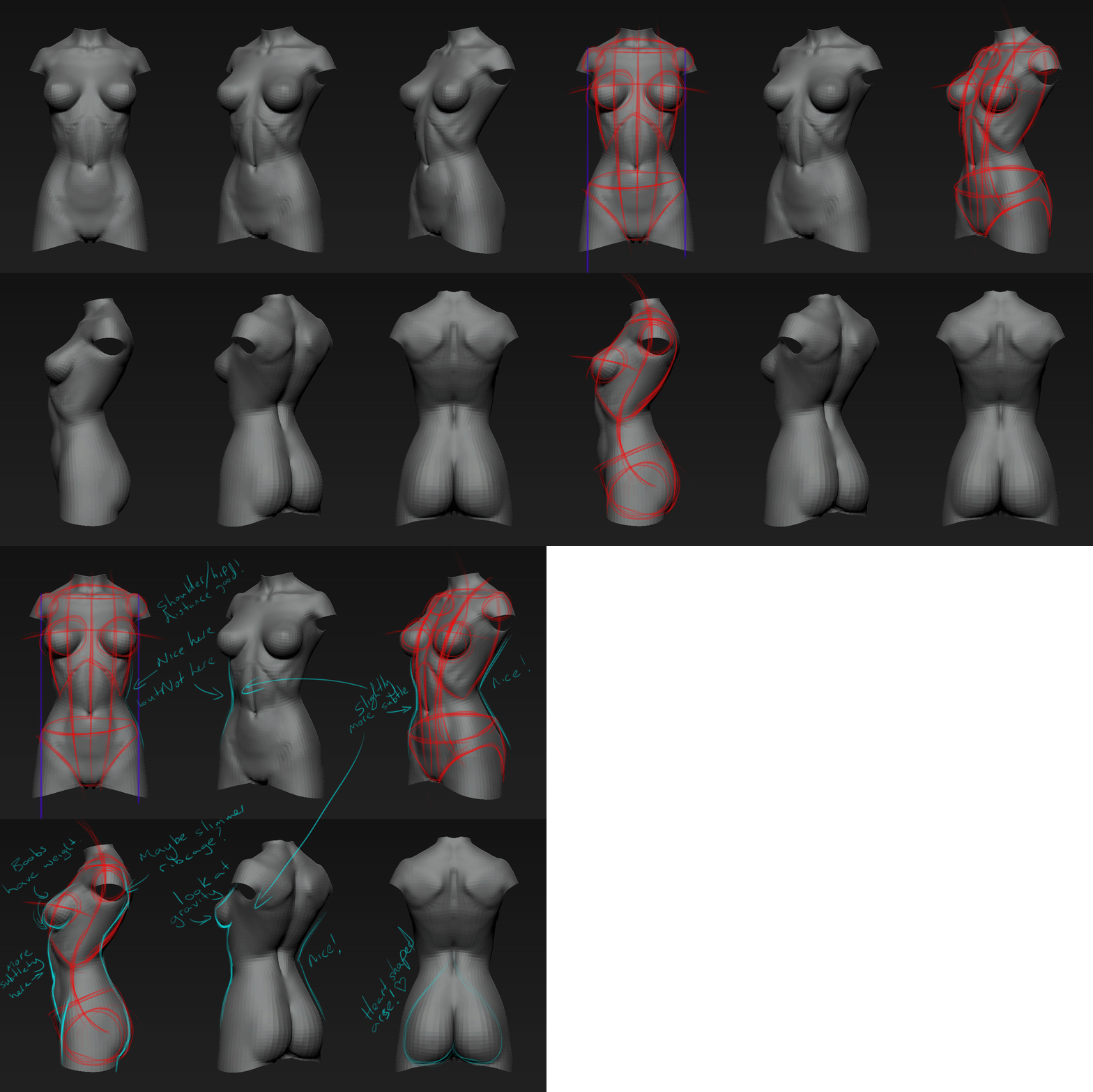
Torso analysis
This step is very similar to how I analysed my sketches. I took a bunch of screenshots from different angles in zbrush, mainly rotating around the y axis. I then sketched some block shapes over the top for the ribcage and hips, along with s-curves and such; almost as if I’d just started doing a whole bunch of sketches instead. And again, when i'd done that, i sketched over the top, and wrote notes about the changes i needed to make, or things i thought were good.
While I did this, I kept flicking back to my reference images, along with a multitude of other naked chicks in various poses and angles. Doing this helped me identify some core problems with where I’d gone so far. It also revealed I’d done some things right too.
- The arse is looking pretty much how I want it to. There are a couple of nitpicks I could make but for now I’m happy with the overall shape.
- I’ve nailed the hip to shoulder ratio. They’re the right distance apart, they match each other. And actually the waist is roughly where it needs to be too. But there are some tweaks needed!
- I need to look at the rib to hip transition in some of the side views, at the moment it’s coming off as very harsh, there’s a lack of subtlety there that’s making her look anorexic!
- I also need to consider slimming down the ribcage a little, bringing the back of her ribcage forward would help make her look more feminine. Yes she’s a marvel hero and has super strength, but a big ribcage leads to mannish proportions.
- The abdomen looks a little strange from the side; it should be more of a flat incline rather than a curve, and then a very subtle outward push just below the belly button.
- The breasts look good from some angles but not from others. There’s a sense of weightlessness to them which I need to fix. They’re pretty big, and need some gravity to make them look “right”. I need to have more of a concave look to the top of them, remember the water balloon!
Here's a handy dandy gif image of the process.
Week 2 - End
Apologies for the late update, i had a rather hectic weekend! this will hopefully bring everyone up to speed with where i was at on sunday (end of week 2).
I spend much of the week tweaking and refining the torso shape, getting it to a place i was happy. i also spent a lot of time on the head. i'm not happy with the head at all now and i can see myself spending the next couple of weeks working on it.
The Torso
after last weeks torso analysis, i made pretty much all the changes i wanted to make to the torso. i've got her looking how i want, slender, toned, but still buxom enough to be sexy. but when it came to getting the bodysuit look, i realised i'd made a bit of a boob (lol) in the topology of the basemesh.
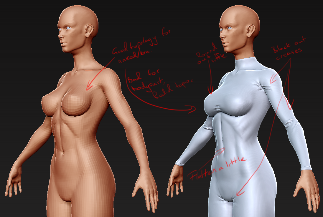
as you can see above, the topology is great if your character is naked, or in just a bra. but for a tshirt or bodysuit you'd want to change some of that topology to the more grid like/uniform structure. it's no big deal, i'd originally intended to sculpt the bodysuit as a layer in zbrush but i ended up exporting the mesh into max, duplicating most of the body, and redoing the chest topology before taking it back in for a project all and then work on the look and feel of a skin-tight suit.
this focused mainly on very gentle use of the "damstandard" brush, blocking in the creases on the lowest subdivision that could handle it. they'll be refined later in week 3 or 4, but for now just getting their positioning was most important.
while doing this, try to remember that there's a body under there. sure a skin tight suit might flatten the flesh underneath in some areas, like the breasts. but it will also diminish some of the natural creases, like the one from the crotch to the iliac crest, and the belly button.
The Head
ugh this is hard. REALLY hard. there are certain points i NEED to hit to make this come out okay.
- she MUST retain her femininity.
- she must have strong features... she's a marvel heroine.
- maintain a strong jawline.
- big sexy lips.
- "dusky" eyes.
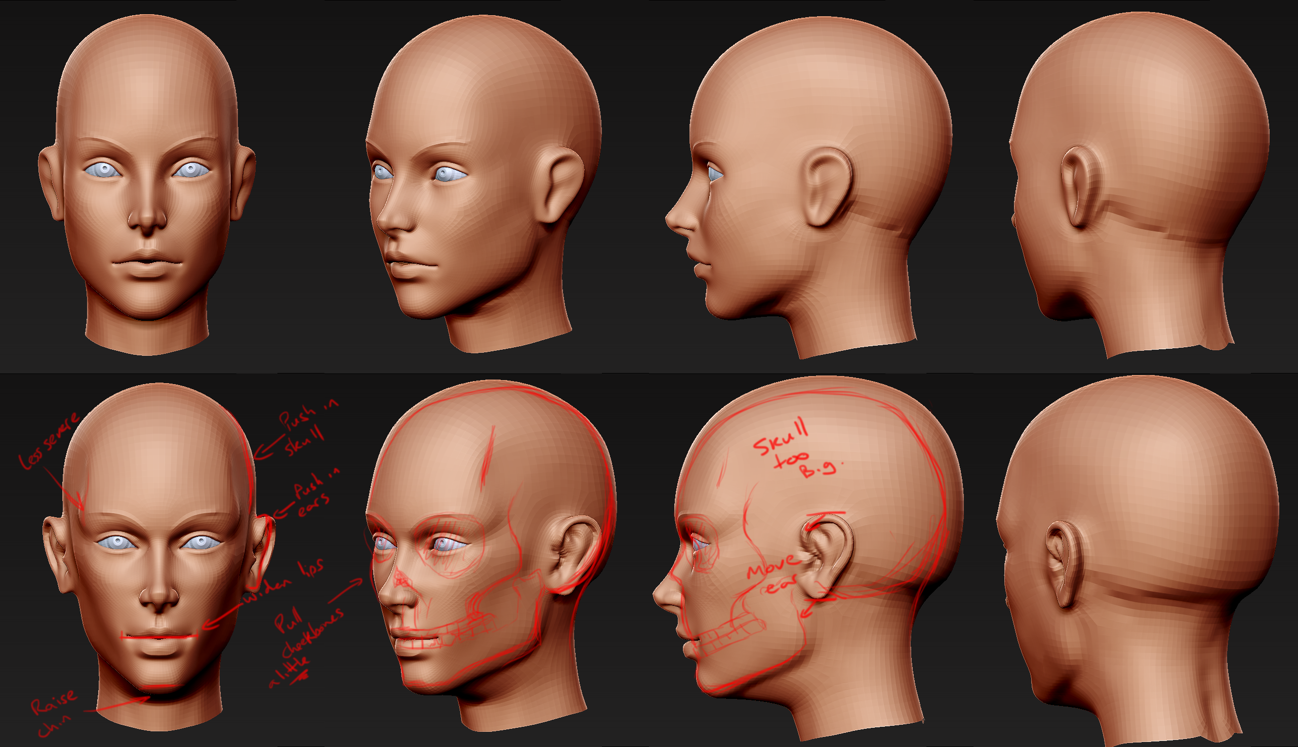
the top set of images is what i was left with after my 1 on 1 with Hazardous. the bottom set of images is where i was at by the end of the week, after tweaking it myself and trying to get it to where i liked it. there's things i like for sure, but a lot that i don't.
- i like the eyes. but they could do with being narrower
- i like the nose. it just "feels right". i like the general shape of the lips... but they're position could use work.
- the lips need to be a little wider.
- the chin could come up a little.
- the general shape of the skull feels wrong.
- the ears are both too high and too far back.
- the jawline is a little TOO strong right now.
- need to soften the temple.
again, just drawing over the screenshots was a big eye opener. it really helped me to see what was wrong and how to fix it. it's something i should have done a lot more in the past but was too lazy. but this whole thing has just opened my eyes to how "bad" i was being before (in the behavioural sense of the word as well as the skill level).
so yeah... DRAW MORE! hah.
i was expecting this update to be a little longer... well, next one will have more cloth stuff in it so that might take a while, and hair too.
Week 3
so this week Haz did another sculptover on my mesh. i watched him do it, completely knackered, total lack of sleep threatening to destroy me. watched him push here, pull there, and before i knew it, Rogue looked like a new woman!
the thing is, when i compare the two, a lot of the major landmarks were fine before he sculpted over. the lips were in the right place, the jawline terminated at the right place, the eyes are the right size/the right distance apart, the nose is the right length etc. so from that point of view, WIN!
but there were a lot of areas where my lack of experience... and his immense amount of experience showed. now, the very first time he did a sculpt over, i just took that mesh and played around with it, keeping what i wanted, changing what i didn't. and to my shame i've only just realised i learned absolutely fuck all by doing that! i thought i'd learned just from watching, but far from it; it barely sunk in at all. so this time i did something a little different!
i did the same analysis that i'd done in the past, sketching, writing notes etc. trying to get a feel for the changes he'd made. but when it came to the sculpting, i decided to load his mesh up in max, put it to one side of my screen, loaded zbrush on the other side, and tried to replicate his changes.
The Analysis
Old Mesh
so at the top here you can see my old mesh. problems included:
- Cheekbones being too sharp and angled wrong. there's no subtle transition from cheekbone to jaw, and the fatty area in between.
- There's an overbite on the bottom jaw, the chin juts out a bit, and the bottom lip is too far forward adding up to a very manly caveman appearance.
- The shape of the skull is far too square.
- The eyebrow isn't defined enough.
- The ears are too long and angled too vertically.
Hazardous's Revision
when you look at haz's revision in the middle, you can see he's gone up an extra subdivision... but that aside, you should be able to see:
- A much more shallow jaw angle.
- He's raised the middle of the upper eye a little
- The cheekbones are well defined, but the transition to the jaw is very gentle.
- He's rounded out the chin and brought it back a little.
- He's reshaped the lips and given them some of the "hazardous magic".
- He's softened the jaw a little in the side view.
- The nostrils transition nicely to the skin around them.
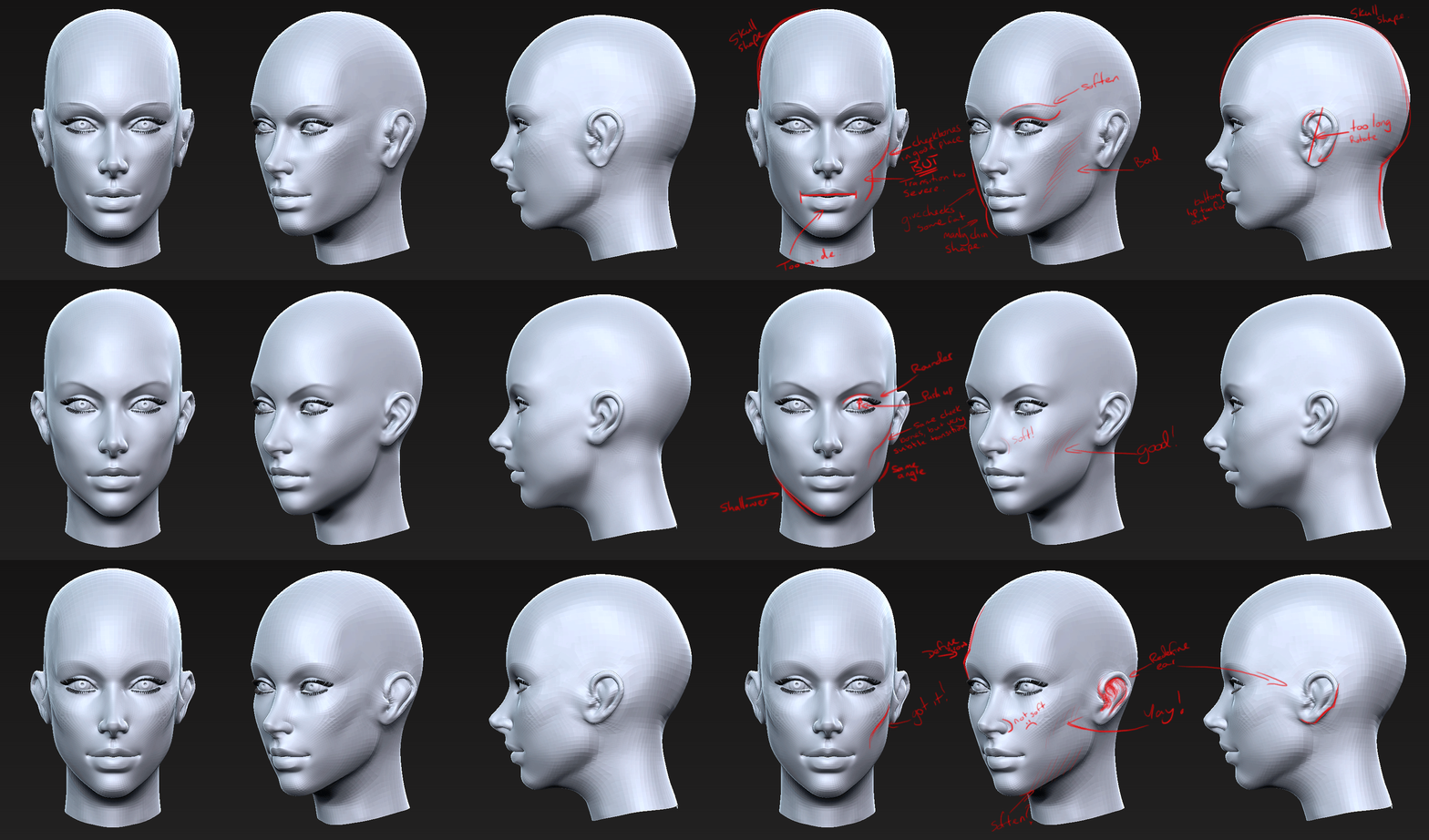
My Revision
and on the bottom you can see my own revision:
- I'm still staying to lower subdivisions to get the forms absolutely solid before committing to any finer details.
- I still need to define the eyebrow a bit more.
- I've fleshed out her face, given her that really soft cheek to jaw transition.
- I've chosen to keep a fairly strong jawline, keeping with the character. but i've also re-angled the jawline.
- I've pulled the chin back but again kept it fairly strong compared to haz's revision.
- I've tweaked the lips, i'll get the magic one day!
- I still need to look at softening the nostril.
this has been an amazing learning experience. i've learned so much doing it this way. more to come!
Week 4
Week 4 is the final week of sculpting. by the end of the week we all hoped to be done with our high-poly meshes and begin looking toward making the final low poly meshes.
so this week i spent a little time finishing up the forms of the character, following up on feedback (note the ass crack), adjusting proportions and finally, adding details. details here means wrinkles and folds in the different clothes she is wearing. i didn't want to add any type of wrinkles or blemishes to the skin in the high poly, those will be left to the texture if they're even added much at all.
so now we get onto the subject of wrinkles... folds in cloth. and it's a lot simpler than you might expect. just about all wrinkles or folds can be catagarized in one of three:
- Crunching - this is the most common. crunching occurs when material is compacted into a smaller space. it most often happens at joints like the elbow, or when a sleeve is pushed up. but you can even see it in a long dress which looks "wavy" when really the cloth is compacted at the waist creating crunches which are really big and smooth by the time they reach the uncompressed bottom of the dress.
- Twisting - like the name suggests, when cloth becomes twisted you can get some pretty interesting folds, they almost always follow the angle of the twist... a simple way to demonstrate this is to create a cylinder in your app of choice, make it 5 sided and no segments along its length, and simply rotate the vertices at one end. the angle of the edges is where the fold would be if it were fabric, and the more twisted the fabric becomes the more extreme the angle.
- Pinching - pinching generally occurs when two or more "crunch hotspots" meet. the best example is usually the armpit. you have crunching from the chest fabric AND the sleeve fabric, everything is all trying to get bunched up together and takes the line of least resistance, usually resulting in star shaped folds radiating from the centre.
here's an image of what I tried to accomplish.
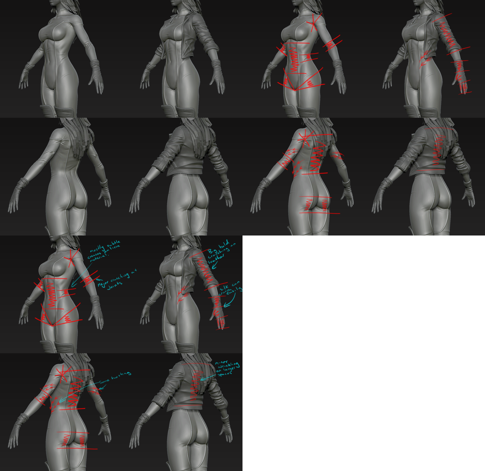
i tried as much as possible to simply visualise this on my mesh, trying to think about where wrinkling would occur most, and also to bear in mind the material it's happening on. for example:
- the main body of the character is covered in a largely skintight material, like a leotard on an athelete. the wrinkles here had to be subtle, not overpowering or distracting. they had to show that it was fabric, but not that it was the centre of attention.
- the boots and jacket are leather, they needed nice big bold creases and folds... the tougher a fabric is the bigger the folds will tend to be as more effort is needed to fold it in the first place.
- the gloves are made of silk, silk tends to fold very easily and not be too resistant to force. rogues gloves look like they should be elbow length but they're down by her wrists, this adds up to a pretty big bunch of fabric all bundled above the wrist... being silk this meant lots of folds!
another note here is that it's NOT super important to be neat and tidy. most folds aren't! having "perfect" lines and edges in your folds will make them look un-natural, realism is about imperfections (in my opinion). so loosten up!
at the same time as all of this there were a couple of things i was conscious of:
- some of the folds should really only be there if the character were in motion or in a particular pose.
- the character can't be in all poses at once so it's important to choose which folds you want in there... it's a functionality vs artistic thing, i guess?
- try to make sure that even your subtle folds are going to be picked up by the normalmap, and that leads to...
- when your character is wearing a skintight outfit, the cloth must always fold OUT! how can it fold in if there's a human body in the way?
and finally, here's a turntable of the final high-poly. http://www.youtube.com/watch?v=0qDVicwyMJM
Week 5
pre-note: all pictures here are at least 3 days old and things have changed since.
This week i'm retopoing/creating the low poly mesh. now, one of the big advantages of having the basemesh set up the way i made it was that the topology is already largely how i want it. the biggest issues i had were in defining specific areas.
Now, there's no real budget here. ultimately this course is about making a sexy woman. but i also want a strong portfolio piece which will say to devs "hey... this guy knows his stuff". well... i HOPE they will say that haha.
So let's face it, this is a "hero character", and this particular hero has... well... "heroic areas" hehe. So it's important that those areas look good, right?! This meant adding more edges to the breasts, and arse. to keep them low poly enough that they're within acceptable limits, but high enough that it looks smooth and round... but that's for later. for now here's:
General tips
For retopo i just use 3ds max's built in freeform tools. they're incredibly easy to use! just select your low poly mesh, in the graphite tools area select freeform, and polydraw. set it to "draw on - surface", and then click "pick" and click your high poly mesh. then using the tools within the freeform ribbon you can retopo while all your verts stick to the high poly mesh like glue!
that said, there are some things you should look into doing during retopo:
- switch the viewport rendering mode to faceted + highlights/remove all smoothing groups from your mesh.
- use a the lowest subdivision of your basemesh as a start to your low poly, it will save you a lot of time!
- your aim is to try and retain volume while keeping a good topology.
- look out for funky lighting on your polygons.
- triangulate specific regions first, then the rest of the mesh.
- turn any edges which could lead to funky lighting or deformation.
- don't be scared of changing areas of your basemesh which don't work with the high poly. it's a base, but that doesn't mean it has to be the final product.
The Face
so with the face, using the above generalities, i went over the mesh. i looked for areas that needed more definition, that weren't filling out the volumes of the high poly, or were just too low resolution for what i wanted. for example:
- i saw that the shading around the jawline was bad, and when i just selected all verts and triangulated it was because the default triangulation was the wrong direction. that's BAD. so i undid, and triangulated hotspot areas for better shading.
- i added defining edges to the brow, and moved some verts around closer to the eye so that if she opens her eyelids they're supported by the brow area.
- created a planar ridge for the eyelashes. if you look closely (really closely) at an eye the lashes do actually sit on their own plane between the lid and the membrane of the eye.
- i added a few edges to the eye to help them keep their shape.
- i added some edges to the lips to help shape and define them next to the low poly.
- i rounded out the ears and helped define them a bit more.
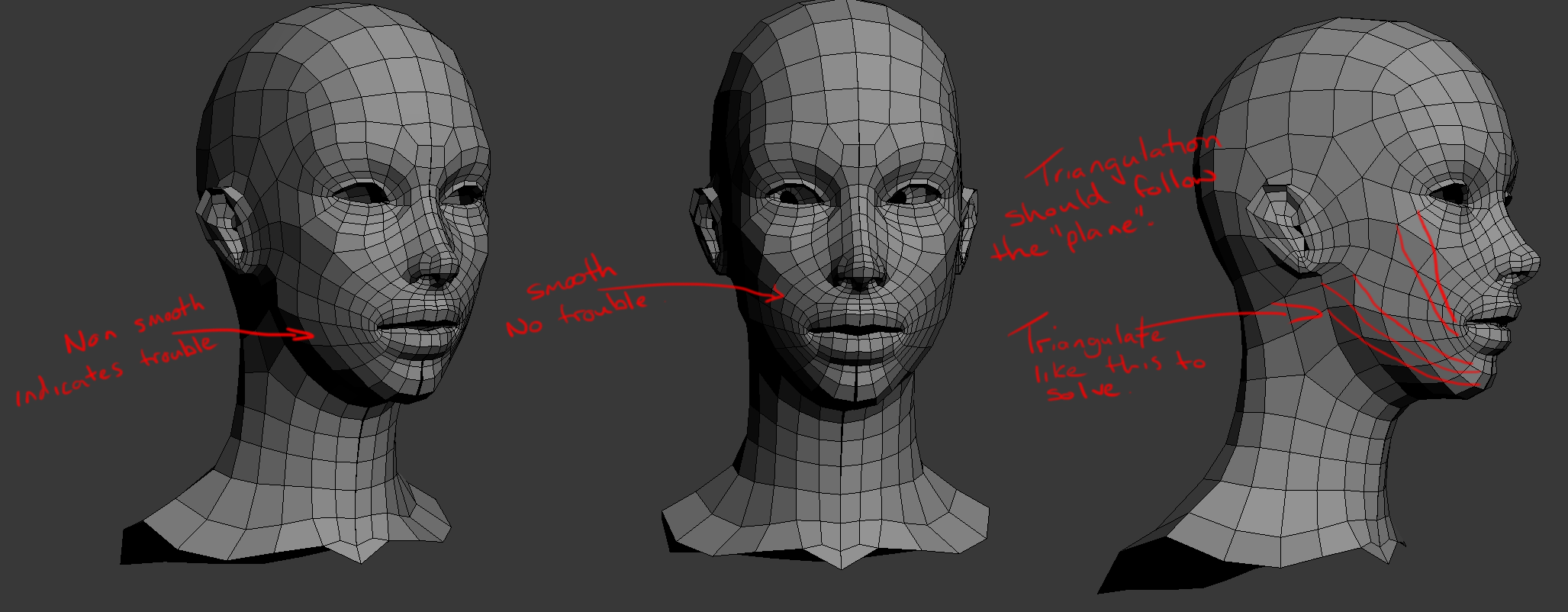
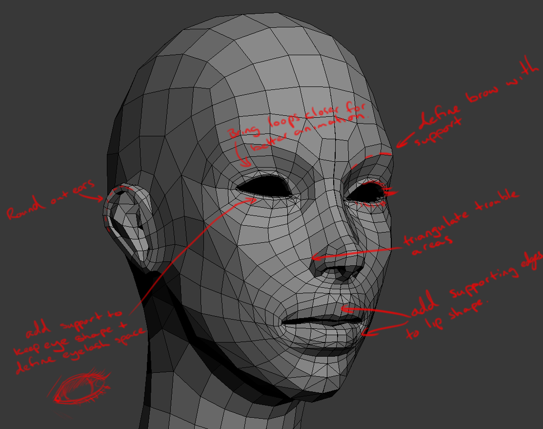
The Hands
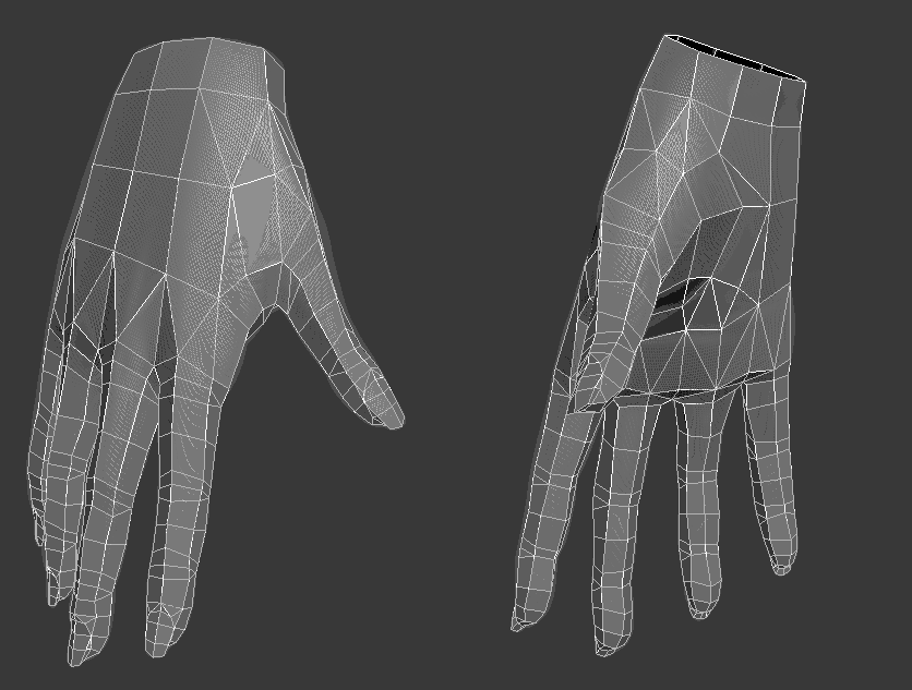
the hands were... well, not fun heh. this was one area where keeping volume was difficult. the fingers were actually really difficult, in fact it's almost impossible to retain the volume on fingers without racking up the amount of sides they have. i eventually just settled for six and i'm happy with the result. As you can see in the images below, there are a few areas where the fleshyness of the high poly just aren't covered by the low poly. that said, i feel like i managed to retain enough of the form that they'll bake down well, and still look womanly and "dainty" so to speak. here are some things to remember:
- use the wiki if you're unsure of how to do certain things. (see Limb Topology, Category:Topology)
- remember that on limbs (fingers) that only bend one way, you should use 3 supporting edges on the outside of the bend to retain shape, and 2 on the inside to allow it to collapse properly.
- remember where the joints are, especially in the thumb. the thumb starts rotating at the wrist, not at the two knuckles you can see.
- uh... can't think of anything else, sorry!
Other bits
for most of the body i just followed what i've already talked about, but i figured i should mention a little on building a low poly with baking normalmaps in mind, for those who haven't done it or want to try it.
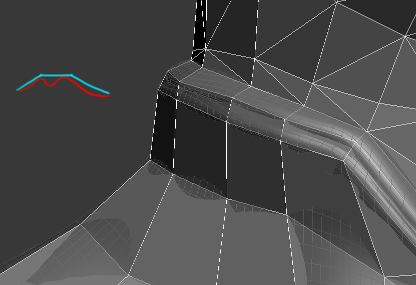
putting it simply, just remember that normalmaps are there to fake internal detail. so when you can save polygons by not trying to define every single bit of that detail, then awesome! but it's just as important to know when you SHOULD be defining detail in the low poly itself.
the best way to do this is just zoom out, any details which can't be seen in the silouhette from "game distance", which is how far zoomed out you usually see your character, can be covered by the normalmap. any details which can be seen that far out should probably be handled by geometry.
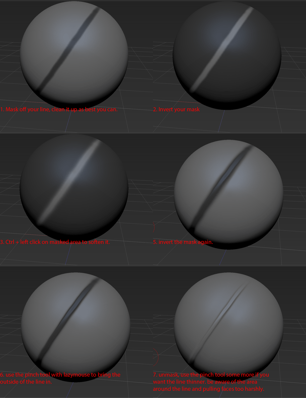
an example of that detail and how to handle it with your geometry, the red line is the high poly, the blue is the low poly.
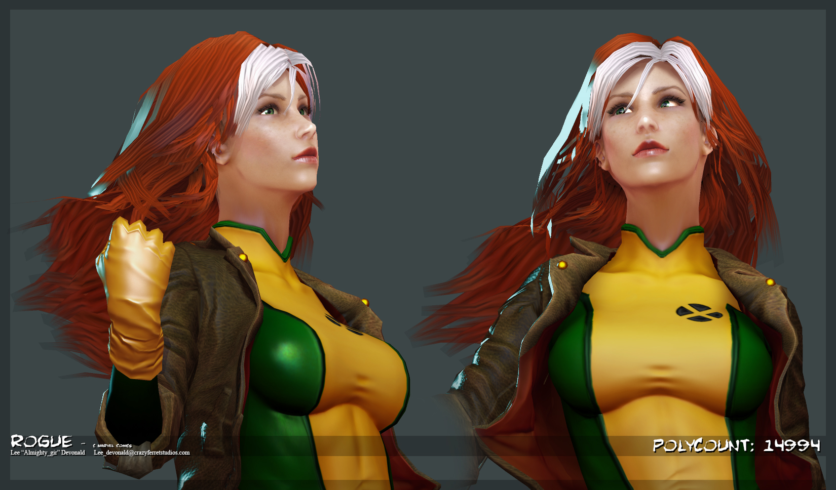
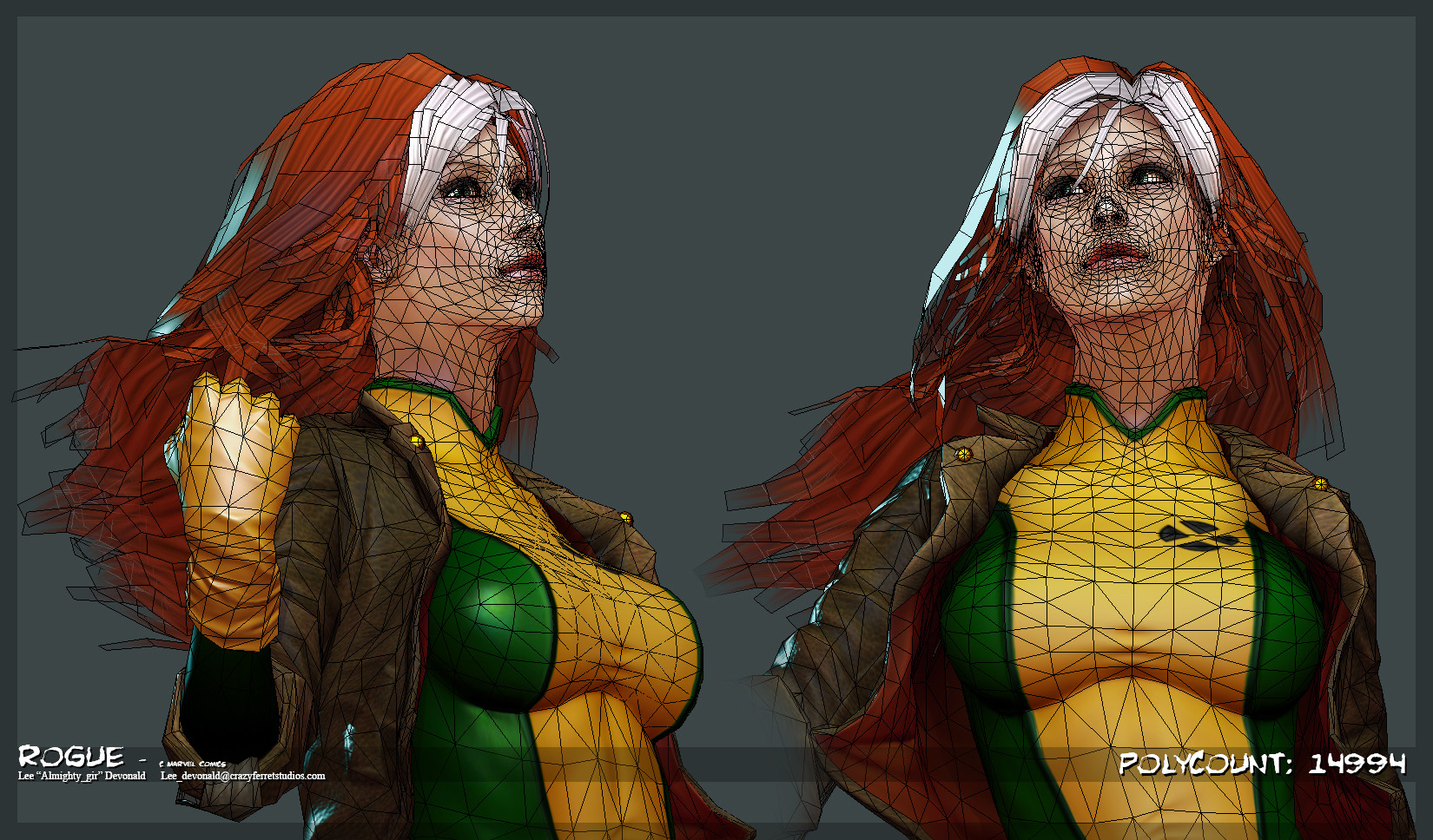
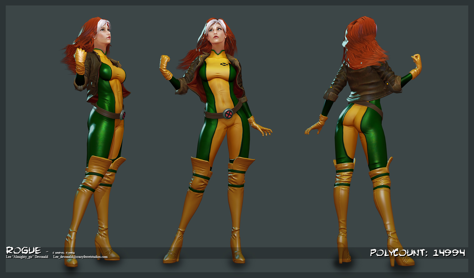
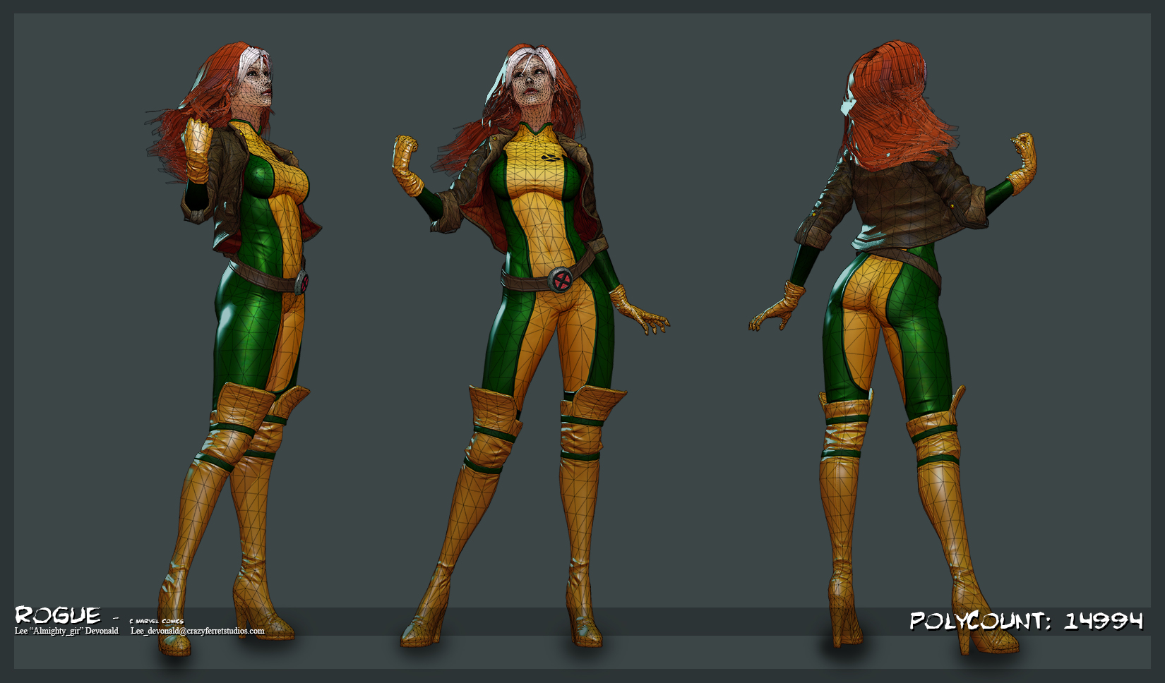
Final Renders
