Difference between revisions of "SkankerzeroModularCharacterSystem"
(work in progress) |
EricChadwick (Talk | contribs) m (Nov 2011) |
||
| (7 intermediate revisions by 2 users not shown) | |||
| Line 1: | Line 1: | ||
= Skankerzero Modular Character System = | = Skankerzero Modular Character System = | ||
| + | November 2011 | ||
| − | + | How to create a modular character system, by [http://www.skankerzero.com/ Jesse 'skankerzero' Sosa]. Mirrored from the Polycount thread [http://www.polycount.com/forum/showthread.php?t=91509 MUTANT Little League TEAM]. | |
| − | + | ||
| − | + | ||
| − | + | ||
| Line 22: | Line 20: | ||
Below is a small example of some that I've done in my past. | Below is a small example of some that I've done in my past. | ||
| − | Back in 2004, I tackled my first modular parts character for [[ | + | Back in 2004, I tackled my first modular parts character for BloodRayne 2. |
| + | [[Image:skankerzero_modular01.jpg|frame|left|Image by [http://www.skankerzero.com/ Jesse 'skankerzero' Sosa].]]<br clear="all"/> | ||
Every human bad guy in BR2 ended up using this technique. All of them used no more than a 512x512. | Every human bad guy in BR2 ended up using this technique. All of them used no more than a 512x512. | ||
Another early example are the females from Aeon Flux. | Another early example are the females from Aeon Flux. | ||
| + | [[Image:skankerzero_modular02.jpg|frame|left|Image by [http://www.skankerzero.com/ Jesse 'skankerzero' Sosa].]]<br clear="all"/> | ||
This is probably a bad example because looking at the texture now it's obvious I didn't use the full texture. I can't quite remember what I did with these characters, but I believe I ended up cramming the male and female textures together into a single 512x512. | This is probably a bad example because looking at the texture now it's obvious I didn't use the full texture. I can't quite remember what I did with these characters, but I believe I ended up cramming the male and female textures together into a single 512x512. | ||
| Line 33: | Line 33: | ||
The first example is a single character that is meant to be viewed at about 75 feet or more away from the camera. | The first example is a single character that is meant to be viewed at about 75 feet or more away from the camera. | ||
| + | [[Image:skankerzero_modular03.jpg|frame|left|Image by [http://www.skankerzero.com/ Jesse 'skankerzero' Sosa].]]<br clear="all"/> | ||
This is considered a single character as it has a single rig that animates all the characters. The rig is less than 32 bones and would animate all the outstretched arms and random heads and bodies to create the illusion of a crowd stirring about. The polycount falls within a single character's budget (12,254 tris). and it uses a single 256x128 texture. | This is considered a single character as it has a single rig that animates all the characters. The rig is less than 32 bones and would animate all the outstretched arms and random heads and bodies to create the illusion of a crowd stirring about. The polycount falls within a single character's budget (12,254 tris). and it uses a single 256x128 texture. | ||
The second example is the crowd system I helped design and build for the game. | The second example is the crowd system I helped design and build for the game. | ||
| + | [[Image:skankerzero_modular04.jpg|frame|left|Image by [http://www.skankerzero.com/ Jesse 'skankerzero' Sosa].]]<br clear="all"/> | ||
This image shows 2 different characters. Both characters use the same rig and animation set. They also share a single 1024x512. This level of detail was to be 25 feet or more away from the camera. We had higher res crowds for the up close shots. | This image shows 2 different characters. Both characters use the same rig and animation set. They also share a single 1024x512. This level of detail was to be 25 feet or more away from the camera. We had higher res crowds for the up close shots. | ||
| Line 54: | Line 56: | ||
phone: | phone: | ||
| + | [[Image:skankerzero_modular05_screenres01.jpg|frame|left|Image by [http://www.skankerzero.com/ Jesse 'skankerzero' Sosa].]]<br clear="all"/> | ||
tablet: | tablet: | ||
| + | [[Image:skankerzero_modular06_screenres02.jpg|frame|left|Image by [http://www.skankerzero.com/ Jesse 'skankerzero' Sosa].]]<br clear="all"/> | ||
A lot of wasted time and effort can go into details that will never be seen at these resolutions. Most detail will 'swim' or 'shimmer' because more than one texture pixel will take up a single screen pixel. The engine has to decide which texture pixel to draw for that screen pixel every frame. Thus, 'swimming' or 'shimmering'. This is why mipmaps are so important. | A lot of wasted time and effort can go into details that will never be seen at these resolutions. Most detail will 'swim' or 'shimmer' because more than one texture pixel will take up a single screen pixel. The engine has to decide which texture pixel to draw for that screen pixel every frame. Thus, 'swimming' or 'shimmering'. This is why mipmaps are so important. | ||
| Line 65: | Line 69: | ||
So now I set up the rules that I will follow for this character asset. | So now I set up the rules that I will follow for this character asset. | ||
| − | + | # 2,500 tris max per variation including equipment and fx | |
| − | + | # 512x512 textures per texture pass | |
| − | + | # 9 total unique characters to form the team | |
I'll further break this down. | I'll further break this down. | ||
| Line 86: | Line 90: | ||
For this, I will be looking at a baseball team and breaking down what I believe is needed to achieve the amount of variation needed. | For this, I will be looking at a baseball team and breaking down what I believe is needed to achieve the amount of variation needed. | ||
| − | |||
| − | |||
| − | |||
| − | |||
| − | |||
| − | |||
| − | |||
| − | |||
| − | |||
| − | + | '''head''' | |
| − | + | * baseball cap | |
| − | + | * baseball batting helmet | |
| − | + | * catchers mask | |
| − | + | * ears x2 | |
| + | * face x3 | ||
| + | * hair x4 | ||
| + | * tongue | ||
| − | + | '''torso''' | |
| − | + | * uniform upper | |
| − | + | * catchers padding | |
| − | + | * jacket over uniform | |
| − | + | ||
| − | + | '''legs''' | |
| − | + | * uniform bottom x2 | |
| + | * catchers padding | ||
| + | * legs x3 | ||
| + | * shoes | ||
| + | * feet x3 | ||
| + | |||
| + | '''arms''' | ||
| + | * uniform sleeve | ||
| + | * jacket sleeve | ||
| + | * baseball mitt | ||
| + | * arms x3 | ||
| + | * hands x3 | ||
| + | |||
| + | '''misc''' | ||
| + | * baseball | ||
| + | * baseball bat | ||
| + | * tentacle that can be used as an arm or leg | ||
| − | |||
| − | |||
| − | |||
| − | |||
| − | |||
| − | |||
| − | |||
| − | |||
| − | |||
| − | |||
| − | |||
| − | |||
All the above is subject to change, but I think this is what it will take to create a good, varied team. | All the above is subject to change, but I think this is what it will take to create a good, varied team. | ||
| Line 137: | Line 139: | ||
For example: If you're going to create 3 characters off one base mesh; A 6ft tall human, a 7 ft tall human, and a 5 ft tall human; your base mesh should be the 6ft tall human. | For example: If you're going to create 3 characters off one base mesh; A 6ft tall human, a 7 ft tall human, and a 5 ft tall human; your base mesh should be the 6ft tall human. | ||
| + | [[Image:skankerzero_modular07_base01.jpg|frame|left|Image by [http://www.skankerzero.com/ Jesse 'skankerzero' Sosa].]]<br clear="all"/> | ||
Do whatever you normally do to get to this point: | Do whatever you normally do to get to this point: | ||
| + | [[Image:skankerzero_modular08_base02.jpg|frame|left|Image by [http://www.skankerzero.com/ Jesse 'skankerzero' Sosa].]]<br clear="all"/> | ||
This is the game mesh I made for this challenge. | This is the game mesh I made for this challenge. | ||
| Line 145: | Line 149: | ||
Let's identify those areas on your base mesh and make sure we built the mesh correctly to accept part variations. | Let's identify those areas on your base mesh and make sure we built the mesh correctly to accept part variations. | ||
| + | [[Image:skankerzero_modular09_parts01.jpg|frame|left|Image by [http://www.skankerzero.com/ Jesse 'skankerzero' Sosa].]]<br clear="all"/> | ||
I have decided to part out the hands and feet as well since they will receive parts such as gloves, mitts, shoes, and bare feet. | I have decided to part out the hands and feet as well since they will receive parts such as gloves, mitts, shoes, and bare feet. | ||
| Line 150: | Line 155: | ||
Be sure that you have complete edge loops where you're parts meet. This will save you many headaches in the future. | Be sure that you have complete edge loops where you're parts meet. This will save you many headaches in the future. | ||
| + | [[Image:skankerzero_modular10_parts02.jpg|frame|left|Image by [http://www.skankerzero.com/ Jesse 'skankerzero' Sosa].]]<br clear="all"/> | ||
Your character should have clean cuts such as below: | Your character should have clean cuts such as below: | ||
| + | [[Image:skankerzero_modular11_parts03.jpg|frame|left|Image by [http://www.skankerzero.com/ Jesse 'skankerzero' Sosa].]]<br clear="all"/> | ||
That's pretty much all there is to setting up your base mesh for parts. | That's pretty much all there is to setting up your base mesh for parts. | ||
| Line 158: | Line 165: | ||
Take this base mesh and uv it quickly. Be sure to make your uv seams along the part seams you determined earlier. This will help a lot later. | Take this base mesh and uv it quickly. Be sure to make your uv seams along the part seams you determined earlier. This will help a lot later. | ||
| + | [[Image:skankerzero_modular12_uv01.jpg|frame|left|Image by [http://www.skankerzero.com/ Jesse 'skankerzero' Sosa].]]<br clear="all"/> | ||
I use Headus UVLayout because I'm a winner, and so should you. | I use Headus UVLayout because I'm a winner, and so should you. | ||
There is no need to pack the uv islands, just go ahead and unwrap it. This can save you time later when you begin to copy geometry off it to create new arms and legs. | There is no need to pack the uv islands, just go ahead and unwrap it. This can save you time later when you begin to copy geometry off it to create new arms and legs. | ||
| + | [[Image:skankerzero_modular13_uv02.jpg|frame|left|Image by [http://www.skankerzero.com/ Jesse 'skankerzero' Sosa].]]<br clear="all"/> | ||
Using Headus UVLayout, that took be a little less than 10 minutes to unwrap and get the consistent result you see in that screenshot. (The eyes are temp, so I didn't bother to uv them.) | Using Headus UVLayout, that took be a little less than 10 minutes to unwrap and get the consistent result you see in that screenshot. (The eyes are temp, so I didn't bother to uv them.) | ||
| Line 172: | Line 181: | ||
I've modeled out: | I've modeled out: | ||
| − | mutant head | + | * mutant head |
| − | mutant arms | + | * mutant arms |
| − | mutant hands | + | * mutant hands |
| − | skeleton head | + | * skeleton head |
| − | skeleton arms | + | * skeleton arms |
| − | skeleton hands | + | * skeleton hands |
| − | baseball cap | + | * baseball cap |
| − | baseball batting helmet | + | * baseball batting helmet |
| − | tentacle legs | + | * tentacle legs |
| − | uniform torso | + | * uniform torso |
| − | uniform pants | + | * uniform pants |
| − | uniform shorts | + | * uniform shorts |
up next are: | up next are: | ||
| − | tentacle arms | + | * tentacle arms |
| − | baseball shoes | + | * baseball shoes |
| − | skeleton legs | + | * skeleton legs |
| − | skeleton feet | + | * skeleton feet |
| − | mutant head #2 | + | * mutant head #2 |
| − | Baseball bat | + | * Baseball bat |
| − | Baseball | + | * Baseball |
| − | Catchers pads | + | * Catchers pads |
screenshots this weekend. | screenshots this weekend. | ||
| Line 205: | Line 214: | ||
1: | 1: | ||
Make sure your verts line up across your parts at the seams. | Make sure your verts line up across your parts at the seams. | ||
| + | [[Image:skankerzero_modular14_parts04.jpg|frame|left|Image by [http://www.skankerzero.com/ Jesse 'skankerzero' Sosa].]]<br clear="all"/> | ||
For example, all your sleeves have to work with all your torsos. | For example, all your sleeves have to work with all your torsos. | ||
| Line 210: | Line 220: | ||
2: | 2: | ||
Make sure your topology around your deforming areas lines up to ensure that there will be no piercing of geometry. | Make sure your topology around your deforming areas lines up to ensure that there will be no piercing of geometry. | ||
| + | [[Image:skankerzero_modular15_parts05.jpg|frame|left|Image by [http://www.skankerzero.com/ Jesse 'skankerzero' Sosa].]]<br clear="all"/> | ||
This should really be general knowledge when it comes to game modeling, but it's easy to overlook when making characters as complex as this. Be sure to test your parts across all your variation parts. | This should really be general knowledge when it comes to game modeling, but it's easy to overlook when making characters as complex as this. Be sure to test your parts across all your variation parts. | ||
| Line 215: | Line 226: | ||
3: | 3: | ||
Keep your pivots at 0,0,0 across all parts. | Keep your pivots at 0,0,0 across all parts. | ||
| + | [[Image:skankerzero_modular16_parts06.jpg|frame|left|Image by [http://www.skankerzero.com/ Jesse 'skankerzero' Sosa].]]<br clear="all"/> | ||
This will ensure that all the parts snap together perfectly when snapped to 0,0,0, such as below: | This will ensure that all the parts snap together perfectly when snapped to 0,0,0, such as below: | ||
| + | [[Image:skankerzero_modular17_parts07.jpg|frame|left|Image by [http://www.skankerzero.com/ Jesse 'skankerzero' Sosa].]]<br clear="all"/> | ||
| + | |||
4: | 4: | ||
Keep your naming convention easy to follow. | Keep your naming convention easy to follow. | ||
| + | [[Image:skankerzero_modular18_parts08.jpg|frame|left|Image by [http://www.skankerzero.com/ Jesse 'skankerzero' Sosa].]]<br clear="all"/> | ||
Be descriptive with the name. Identify left and right with _L and _R. If a model has similar multiple objects like toes or fingers use numbers. | Be descriptive with the name. Identify left and right with _L and _R. If a model has similar multiple objects like toes or fingers use numbers. | ||
| Line 225: | Line 240: | ||
For sorting purposes, I try and define the region first. This will ensure that all the parts will sort together alphabetically. | For sorting purposes, I try and define the region first. This will ensure that all the parts will sort together alphabetically. | ||
| − | + | Regions can include the following: | |
| − | + | * Head_ | |
| − | + | * Torso_ | |
| − | + | * Leg_ | |
| − | + | * Arm_ | |
| − | + | * Hand_ | |
| − | + | * Foot_ | |
| − | + | * Sleeve_ | |
| − | + | * Pants_ | |
| − | + | * etc. | |
| − | + | ||
The key is to be descriptive so selecting parts is easy for you. | The key is to be descriptive so selecting parts is easy for you. | ||
== Now Let's Look At How I Applied The Above To My Model == | == Now Let's Look At How I Applied The Above To My Model == | ||
| + | |||
| + | [[Image:skankerzero_modular19_parts09.jpg|frame|left|Image by [http://www.skankerzero.com/ Jesse 'skankerzero' Sosa].]]<br clear="all"/> | ||
All parts have a pivot at 0,0,0. | All parts have a pivot at 0,0,0. | ||
| + | [[Image:skankerzero_modular20_parts10.jpg|frame|left|Image by [http://www.skankerzero.com/ Jesse 'skankerzero' Sosa].]]<br clear="all"/> | ||
They all snap perfectly together at 0,0,0. | They all snap perfectly together at 0,0,0. | ||
| + | [[Image:skankerzero_modular21_parts11.jpg|frame|left|Image by [http://www.skankerzero.com/ Jesse 'skankerzero' Sosa].]]<br clear="all"/> | ||
I followed a naming convention that makes sense for this file: | I followed a naming convention that makes sense for this file: | ||
| + | [[Image:skankerzero_modular22_parts12.jpg|frame|left|Image by [http://www.skankerzero.com/ Jesse 'skankerzero' Sosa].]]<br clear="all"/> | ||
All verts snap perfectly across parts: | All verts snap perfectly across parts: | ||
| + | [[Image:skankerzero_modular23_parts13.jpg|frame|left|Image by [http://www.skankerzero.com/ Jesse 'skankerzero' Sosa].]]<br clear="all"/> | ||
The above image shows some of the possible combinations available. | The above image shows some of the possible combinations available. | ||
| Line 265: | Line 285: | ||
== More Info == | == More Info == | ||
| − | [[ | + | I'm going to be uving these guys next and adding what geometry I'm missing all this week. Hopefully I'll be starting texturing this coming weekend. |
| + | |||
| + | Quote: Originally Posted by slipsius | ||
| + | Is that what you do in the end of it all? combine them and export? or do you export each piece and let the programmers randomize it some how? | ||
| + | |||
| + | For this challenge, I'll isolate variations and delete the excess. | ||
| + | When I was at TRI, we would export the full model with all the parts out. We would randomize it in real time with an XML sheet that contained the rules for randomization. It was all naming convention based. | ||
| + | |||
| + | Quote: | ||
| + | Also, what kind of rigging issues do you run into? In one of your first examples, there were some variations of suspenders. Is that a pain in the ass to paint the weights for to have no clipping? | ||
| + | |||
| + | Usually there is very little issues when it comes to rigging. As long as I follow my rules then they should work just as well as any other characters. | ||
| + | Suspenders aren't that big of an issue. The geometry has to mirror the geometry that's underneath them. It will lead to some crappy looking topology, but they will deform exactly like the torso. | ||
| + | |||
| + | Quote: | ||
| + | Also, Great first mutant* Whats the tri count on it? | ||
| + | |||
| + | Thanks! | ||
| + | Each variation is roughly 2500. I'll make sure to optimize on the final models if I have to. | ||
| + | |||
| + | == UV Mapping your parts == | ||
| + | Once you've created your parts, it's time to uvmap them. | ||
| + | |||
| + | Follow whatever pipeline you are comfortable with. | ||
| + | For this I'm using Headus UVLayout. I take all my parts and unfold them. | ||
| + | [[Image:skankerzero_modular24_uv03.jpg|frame|left|Image by [http://www.skankerzero.com/ Jesse 'skankerzero' Sosa].]]<br clear="all"/> | ||
| + | |||
| + | I then take them back into Max and check to make sure there isn't any distortion. | ||
| + | [[Image:skankerzero_modular25_uv04.jpg|frame|left|Image by [http://www.skankerzero.com/ Jesse 'skankerzero' Sosa].]]<br clear="all"/> | ||
| + | |||
| + | At this point, I take some time to go and model a couple more heads and body parts. | ||
| + | |||
| + | Now it's time to pack your uvs. | ||
| + | |||
| + | == Packing your UVs == | ||
| + | |||
| + | Before we begin packing our uvs, let's take a step back and think about how we want to lay them out. | ||
| + | |||
| + | One thing most game artists don't know (especially character artists) is that every 32-bit texture is actually 4 grayscale textures. | ||
| + | [[Image:skankerzero_modular26_uv05.jpg|frame|left|Image by [http://www.skankerzero.com/ Jesse 'skankerzero' Sosa].]]<br clear="all"/> | ||
| + | |||
| + | This means that with a single 512x512 you have the same amount of pixels as a 1024x1024 if you choose to texture your character only using grayscale. This is, of course, if your game's shader system allows you to use individual channels. I'm using Terminal Reality's Infernal Engine, and it lets you do just that. | ||
| + | |||
| + | For my model, I decided that I need full RGB for certain pieces of the model, but not all of it. So this means that I'm going to use the RGB channel to color those areas and the other areas will be mapped through the alpha channel. | ||
| + | |||
| + | My first step is to separate the geometry into the two groups and pack each group into it's own space. | ||
| + | [[Image:skankerzero_modular27_uv06.jpg|frame|left|Image by [http://www.skankerzero.com/ Jesse 'skankerzero' Sosa].]]<br clear="all"/> | ||
| + | |||
| + | Each group should now have it's own set of uvs. | ||
| + | [[Image:skankerzero_modular28_uv07.jpg|frame|left|Image by [http://www.skankerzero.com/ Jesse 'skankerzero' Sosa].]]<br clear="all"/> | ||
| + | |||
| + | * Protip - | ||
| + | As I was packing the uvs, if it turned out I needed to scale the uv islands, I would collapse the stack, select both groups, and scale ALL the islands across both groups to keep the pixel density consistent across the entire model. | ||
| + | |||
| + | Once you have packed all your pieces, you're ready to move to the next step. | ||
| + | |||
| + | == Preparing the Textures == | ||
| + | |||
| + | We all have our own pipelines, but I thought I would give you guys a peek into mine. I won't break apart my pipeline as that can be saved for another time. | ||
| + | |||
| + | Here are some snapshots: | ||
| + | |||
| + | Baking lighting onto all the parts. | ||
| + | [[Image:skankerzero_modular29_textures01.jpg|frame|left|Image by [http://www.skankerzero.com/ Jesse 'skankerzero' Sosa].]]<br clear="all"/> | ||
| + | |||
| + | [[Image:skankerzero_modular30_textures02.jpg|frame|left|Image by [http://www.skankerzero.com/ Jesse 'skankerzero' Sosa].]]<br clear="all"/> | ||
| + | |||
| + | |||
| + | Taking all the parts and piecing together your unique characters. | ||
| + | [[Image:skankerzero_modular31_textures03.jpg|frame|left|Image by [http://www.skankerzero.com/ Jesse 'skankerzero' Sosa].]]<br clear="all"/> | ||
| + | |||
| + | Texture wip sneak peek: | ||
| + | [[Image:skankerzero_modular32_textures04.jpg|frame|left|Image by [http://www.skankerzero.com/ Jesse 'skankerzero' Sosa].]]<br clear="all"/> | ||
| + | |||
| + | == Texturing == | ||
| + | |||
| + | Finished texturing all 9 characters. | ||
| + | [[Image:skankerzero_modular33_textures05.jpg|frame|left|Image by [http://www.skankerzero.com/ Jesse 'skankerzero' Sosa].]]<br clear="all"/> | ||
| + | |||
| + | RGB and Alpha: | ||
| + | [[Image:skankerzero_modular34_textures06.jpg|frame|left|Image by [http://www.skankerzero.com/ Jesse 'skankerzero' Sosa].]]<br clear="all"/> | ||
| + | |||
| + | I'm texturing using my own style. I developed my style as a way to make my 3d models look like my illustrations. It is very illustrative. I do a majority of it with the polygon lasso tool and a couple taps of the airbrush. | ||
| + | The above screens have no lighting in max. | ||
| + | |||
| + | Up next is playing with masks to color the uniforms. | ||
| + | |||
| + | Also. Have to build a base for the group to stand on. | ||
| + | I will also be building mock screenshots for 'menu selection' to show the characters within the context of the 'game'. | ||
| + | |||
| + | == Q&A == | ||
| + | |||
| + | Quote: | ||
| + | Right now most of it looks very grey. Did you do that on purpose so that in unreal or whatever, you just play with materials to add colour or what? | ||
| + | |||
| + | You are correct. A mask image will be used to apply color to the uniforms. | ||
| + | |||
| + | Quote: | ||
| + | Also, a little crit. Im personally not a fan of the shorts. Well, actually that's not true. I like the shorts, but I feel you need another variation thrown in there as well. They are all the same. Every other section of the body has variations, and it shows nicely when lined up. But when lined up, the shorts are clearly reused on EVERY model. Im sure it has something to do with the poly limits, but I feel that that is your room for improvement. | ||
| + | |||
| + | You're right too. I was going to give one of the robots pants, but then decided against it. So right now the two captains have the pants. | ||
| + | |||
| + | All these guys are modular, so in the end, I can add pants to whoever I want depending on the final pose. | ||
| + | |||
| + | Quote: | ||
| + | One thing though: In your colored Texture you are using a lot of one-colored objects (each island has a very dominant color). Wouldn't it have been more efficient to use Vertex Colors for these parts as well, allowing you to use 4 individual textures (each channel one) and therefore double the Texel-Density? | ||
| + | |||
| + | You're right. I'll go back in there and add more color to the shadows. | ||
| + | |||
| + | There were a couple parts that were going to be colored through the shader (like the skeleton bones), but in the end I didn't have enough room in the alpha for their uvs, so I put them into the rgb. | ||
| + | |||
| + | Quote: | ||
| + | OT but could you show the rig for this crowd? | ||
| + | |||
| + | If I get time to. The rig for that is in Maya, and I don't have access to that right now. | ||
| + | |||
| + | Quote: | ||
| + | I couldn't help but notice each of your players have a different number. Is there some shader magic here ? | ||
| + | |||
| + | Nope, just different uv coordinates. If I had a programmer with me and this was an actual game, the uv coordinates for the numbers would be the same and I would use a font for the number. For this competition though, I just had to fake it. | ||
| + | |||
| + | Thanks for all the feedback guys* Hopefully I'll have time to make this as awesome as I can. | ||
| + | |||
| + | Quote: | ||
| + | Its not so much the pants that I meant. Im talking about the top half of the legs. every character has those spikes around its legs, which make them all appear to be shorts? its the upper half that i think needs variation. cant wait to see this finished though. You've done an amazing job so far. | ||
| + | |||
| + | oh hmm. Yeah. not sure what to do about that at this point. The most that can be done is variation in the spikes. | ||
| + | |||
| + | One of the limitations when it comes to making a crowd system is not being able to fully customize each character as you want to. It's all about compromise. | ||
| + | |||
| + | I think the screenshot might have something to do with the repetitive feeling of the thigh spikes. When I rotate the model around to the front, its not so noticeable. I'm hoping when they're all posed and grouped together, it will just feel 'right' and bring them together as a team. | ||
| + | |||
| + | Quote: | ||
| + | nice work Jesse, how are you getting the resolution on the logos and numbers? | ||
| + | Hey Austin! | ||
| + | |||
| + | I'm using a mask image in which the R channel is the detail for the decals, and the A is the opacity for them. | ||
| + | |||
| + | I crammed 4 masks for uniform color in the G and using a 2d transform to stretch them out and offset them before piping color through them. | ||
| + | |||
| + | Then in the B channel, I have 4 more masks for the robots and the color for the logos. I use a 2d transform to stretch them out and pipe colors through them as well. | ||
| + | |||
| + | So basically the G and B channels hold 8 256x256 texture masks. | ||
| + | |||
| + | [[Image:skankerzero_modular35_flats.jpg|frame|left|Image by [http://www.skankerzero.com/ Jesse 'skankerzero' Sosa].]]<br clear="all"/> | ||
| + | |||
| + | It's a complex shader as you can imagine, but there were no shader limitations in this challenge, so yay! | ||
| + | |||
| + | group shot wip | ||
| + | [[Image:skankerzero_modular35_wip.jpg|frame|left|Image by [http://www.skankerzero.com/ Jesse 'skankerzero' Sosa].]]<br clear="all"/> | ||
| + | |||
| + | |||
| + | == Results == | ||
| + | |||
| + | [[Image:skankerzero_modular35_final_beauty_01.jpg|frame|left|Image by [http://www.skankerzero.com/ Jesse 'skankerzero' Sosa].]]<br clear="all"/> | ||
| + | |||
| + | [[Image:skankerzero_modular35_final_group_trans.png|frame|left|Image by [http://www.skankerzero.com/ Jesse 'skankerzero' Sosa].]]<br clear="all"/> | ||
| + | |||
| + | [[Image:skankerzero_modular35_final_cover_full_res.jpg|frame|left|Image by [http://www.skankerzero.com/ Jesse 'skankerzero' Sosa].]]<br clear="all"/> | ||
| + | |||
| + | [[Image:skankerzero_modular35_flats.jpg|frame|left|Image by [http://www.skankerzero.com/ Jesse 'skankerzero' Sosa].]]<br clear="all"/> | ||
| + | |||
| + | Individual character sheets: | ||
| + | |||
| + | [[Image:skankerzero_modular36_sheet01.jpg|frame|left|Image by [http://www.skankerzero.com/ Jesse 'skankerzero' Sosa].]]<br clear="all"/> | ||
| + | |||
| + | [[Image:skankerzero_modular37_sheet02.jpg|frame|left|Image by [http://www.skankerzero.com/ Jesse 'skankerzero' Sosa].]]<br clear="all"/> | ||
| + | |||
| + | [[Image:skankerzero_modular38_sheet03.jpg|frame|left|Image by [http://www.skankerzero.com/ Jesse 'skankerzero' Sosa].]]<br clear="all"/> | ||
| + | |||
| + | [[Image:skankerzero_modular39_sheet04.jpg|frame|left|Image by [http://www.skankerzero.com/ Jesse 'skankerzero' Sosa].]]<br clear="all"/> | ||
| + | |||
| + | [[Image:skankerzero_modular40_sheet05.jpg|frame|left|Image by [http://www.skankerzero.com/ Jesse 'skankerzero' Sosa].]]<br clear="all"/> | ||
| + | |||
| + | [[Image:skankerzero_modular41_sheet06.jpg|frame|left|Image by [http://www.skankerzero.com/ Jesse 'skankerzero' Sosa].]]<br clear="all"/> | ||
| + | |||
| + | [[Image:skankerzero_modular42_sheet07.jpg|frame|left|Image by [http://www.skankerzero.com/ Jesse 'skankerzero' Sosa].]]<br clear="all"/> | ||
| + | |||
| + | [[Image:skankerzero_modular43_sheet08.jpg|frame|left|Image by [http://www.skankerzero.com/ Jesse 'skankerzero' Sosa].]]<br clear="all"/> | ||
| + | |||
| + | [[Image:skankerzero_modular44_sheet09.jpg|frame|left|Image by [http://www.skankerzero.com/ Jesse 'skankerzero' Sosa].]]<br clear="all"/> | ||
---- | ---- | ||
| − | [[Category:Character]] [[Category: | + | [[Category:Character]] [[Category:CharacterModeling]] [[Category:CharacterTexturing]] [[Category:EnvironmentModularity]] |
Latest revision as of 08:25, 27 September 2017
Contents
- 1 Skankerzero Modular Character System
- 1.1 Modular Assets
- 1.2 Knowing Your Platform aka: Being A Smart And Efficient Artist
- 1.3 Setting Up The Rules
- 1.4 Identifying Parts
- 1.5 Creating A Proper Base Mesh
- 1.6 UV Your Base Mesh Now
- 1.7 Progress
- 1.8 Making Sure Your Parts Work Across Variations
- 1.9 Now Let's Look At How I Applied The Above To My Model
- 1.10 This is what I have so far
- 1.11 More Info
- 1.12 UV Mapping your parts
- 1.13 Packing your UVs
- 1.14 Preparing the Textures
- 1.15 Texturing
- 1.16 Q&A
- 1.17 Results
Skankerzero Modular Character System
November 2011
How to create a modular character system, by Jesse 'skankerzero' Sosa. Mirrored from the Polycount thread MUTANT Little League TEAM.
I'm going to kick this contest up a notch and make A WHOLE TEAM using the specs for a single character.
I'll try my best to document what I do to help others think outside of the box in the future. I'll also try and write down my brainstorming process.
Modular Assets
For this 'character' I will be creating a modular asset.
By 'modular asset' I mean an asset that can act as a lego piece if you will.
During my 9 years at Terminal Reality, I spearheaded our crowd / parting system on the art side. We created characters that used a single animation rig and were made out of parts that were swapped according to an XML file. In that file we defined specific variants and the parts they worked with. We were also able to completely randomize the character using parts and creating an exception list of parts that didn't work together.
Below is a small example of some that I've done in my past.
Back in 2004, I tackled my first modular parts character for BloodRayne 2.

Every human bad guy in BR2 ended up using this technique. All of them used no more than a 512x512.
Another early example are the females from Aeon Flux.

This is probably a bad example because looking at the texture now it's obvious I didn't use the full texture. I can't quite remember what I did with these characters, but I believe I ended up cramming the male and female textures together into a single 512x512.
Following are two examples from Ghostbusters:
The first example is a single character that is meant to be viewed at about 75 feet or more away from the camera.
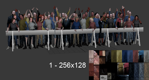
This is considered a single character as it has a single rig that animates all the characters. The rig is less than 32 bones and would animate all the outstretched arms and random heads and bodies to create the illusion of a crowd stirring about. The polycount falls within a single character's budget (12,254 tris). and it uses a single 256x128 texture.
The second example is the crowd system I helped design and build for the game.

This image shows 2 different characters. Both characters use the same rig and animation set. They also share a single 1024x512. This level of detail was to be 25 feet or more away from the camera. We had higher res crowds for the up close shots. What you see here is the final assets that made it into the game. The original assets had twice as many parts but had to be cut down in order to fit the memory footprint for the levels. Each possible variant was around 1500 - 1700 tris. The above image is the 'low poly' character assets that I created off the 'higher poly' assets delivered to us from the outsourcers. I had them deliver the assets in such a way that I could easily piece together unique character NPCs whenever they were needed. This is all thanks to a modular setup across all character models. For example; If we wanted Bill Murray to wear jeans and a shirt, I could easily drop his head into a scene and merge in a shirt and some jeans from the crowd system and in just minutes we had a new Bill Murray variant.
I could go on and on about creating modular crowd assets, but perhaps that would be best for another time.
For now, I'm going to apply the same knowledge and theories to create a full little league team for this challenge.
Knowing Your Platform aka: Being A Smart And Efficient Artist
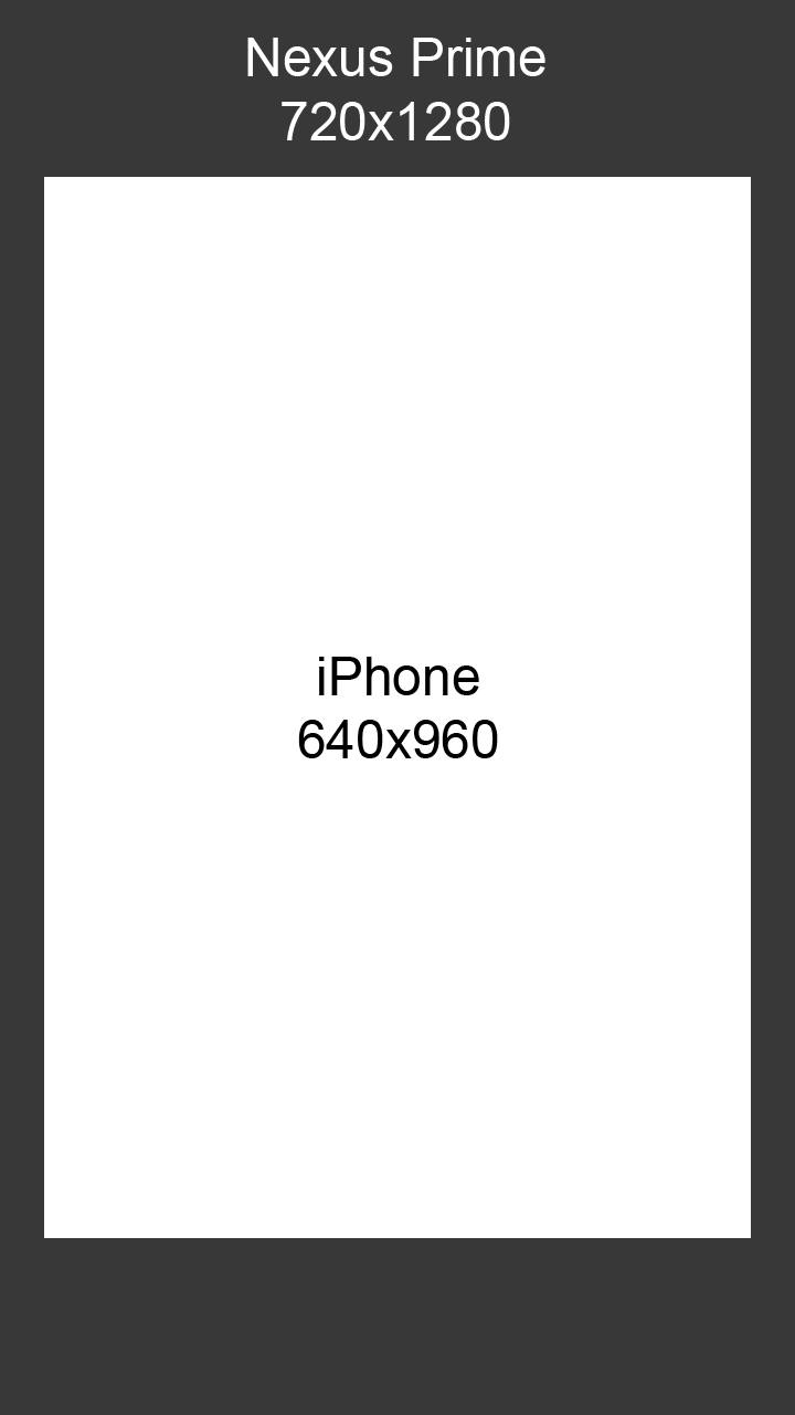
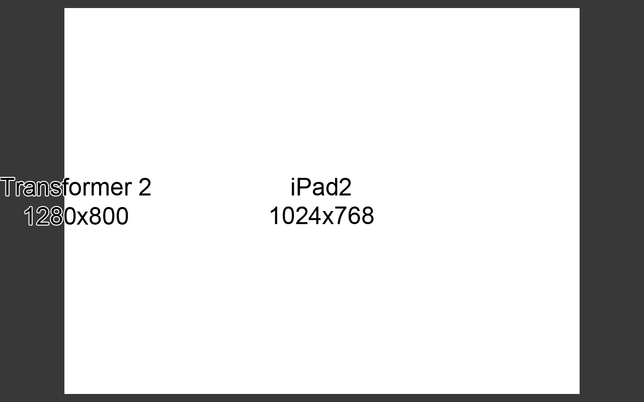
First step is to know your platform. Often time there is a lot of wasted effort put into characters simply because artists don't understand the platform they're building for. In this challenge we're aiming at the mobile market. Below are two images that show the screen resolutions for the phone and tablet platforms.
phone:
tablet:
A lot of wasted time and effort can go into details that will never be seen at these resolutions. Most detail will 'swim' or 'shimmer' because more than one texture pixel will take up a single screen pixel. The engine has to decide which texture pixel to draw for that screen pixel every frame. Thus, 'swimming' or 'shimmering'. This is why mipmaps are so important.
Knowing this, I will also choose an appropriate art and texture style to accommodate the final platform. A simpler art style will also be advantageous when I have to assign less texture space to certain parts.
Setting Up The Rules
So now I set up the rules that I will follow for this character asset.
- 2,500 tris max per variation including equipment and fx
- 512x512 textures per texture pass
- 9 total unique characters to form the team
I'll further break this down.
- The modular asset will be much more than 2500 tris, but the final unique variations will all fall within the limitation.
- I will be using a 512x512 diffuse in the rgb with the specular in the alpha for all the parts. I will also be using a 512x512 rgba image for masks. I will not be using bump maps because the final deliverable will be screenshots. Bump maps are only good for high end renders and motion. So they will be a waste of my time. This all goes into being a smart and efficient artist.
- I will take the modular models, mix and match parts, and squash and stretch proportions to create 9 unique characters with minimal effort. It can be assumed that each character will be on it's own rig with it's own animation set, so this frees me of the single rig limitation when it comes to proportions.
I can also go in and edit the mesh on each unique character as I see fit as long as I don't go above 2500 tris.
Identifying Parts
With most crowd characters, a lot of time is spent studying reference to see what makes up the crowd you're building.
On Ghostbusters, I watched and took lots of screenshots from the 1991 - 1992 seasons of Seinfeld. That was the year and location of the crowd I was building.
I had to identify the key elements that people wore during the fall season. For this, I will be looking at a baseball team and breaking down what I believe is needed to achieve the amount of variation needed.
head
- baseball cap
- baseball batting helmet
- catchers mask
- ears x2
- face x3
- hair x4
- tongue
torso
- uniform upper
- catchers padding
- jacket over uniform
legs
- uniform bottom x2
- catchers padding
- legs x3
- shoes
- feet x3
arms
- uniform sleeve
- jacket sleeve
- baseball mitt
- arms x3
- hands x3
misc
- baseball
- baseball bat
- tentacle that can be used as an arm or leg
All the above is subject to change, but I think this is what it will take to create a good, varied team.
The list may seem like a lot of work, but trust me, it's not. A lot of it comes from creating a good base model with uvs. From there it's only a matter pushing and pulling verts to create different shapes, moving uvs, and adjusting textures.
If time allows for it, I will also create the away team using the same textures and masks to create a whole different team.
Creating A Proper Base Mesh
When people think of 'base meshes' they usually think of either a Z-Brush base mesh or your standard 'naked human' base mesh. For this example we're going with the latter.
In a crowd system, your base mesh should be the most average character contained within the system. This means you can push and pull the verts to extremes without having too much uv distortion.
For example: If you're going to create 3 characters off one base mesh; A 6ft tall human, a 7 ft tall human, and a 5 ft tall human; your base mesh should be the 6ft tall human.
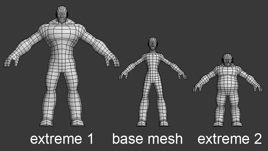
Do whatever you normally do to get to this point:
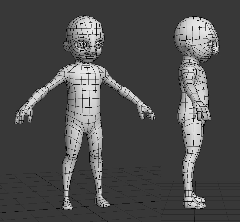
This is the game mesh I made for this challenge.
Now, let's reference back to the parts list I created.
Let's identify those areas on your base mesh and make sure we built the mesh correctly to accept part variations.
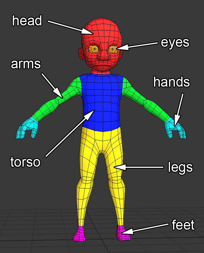
I have decided to part out the hands and feet as well since they will receive parts such as gloves, mitts, shoes, and bare feet. Try to place your parts at clothing seams. As I have learned over the years, this is the easiest way to do part swapping.
Be sure that you have complete edge loops where you're parts meet. This will save you many headaches in the future.
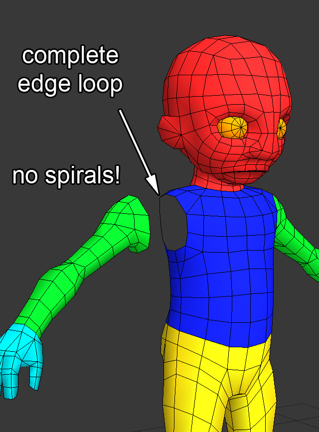
Your character should have clean cuts such as below:
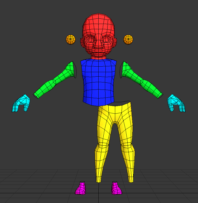
That's pretty much all there is to setting up your base mesh for parts.
UV Your Base Mesh Now
Take this base mesh and uv it quickly. Be sure to make your uv seams along the part seams you determined earlier. This will help a lot later.
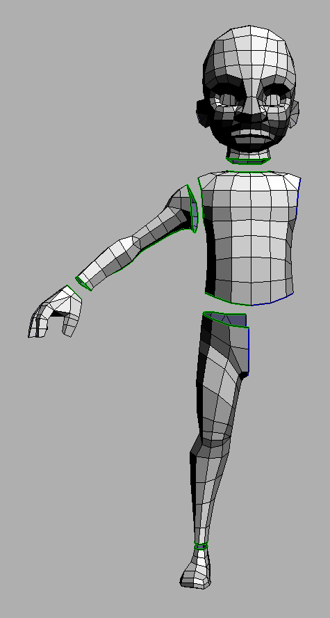
I use Headus UVLayout because I'm a winner, and so should you.
There is no need to pack the uv islands, just go ahead and unwrap it. This can save you time later when you begin to copy geometry off it to create new arms and legs.
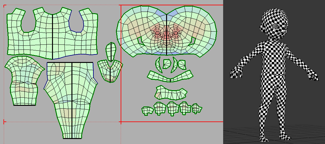
Using Headus UVLayout, that took be a little less than 10 minutes to unwrap and get the consistent result you see in that screenshot. (The eyes are temp, so I didn't bother to uv them.)
The next step is to take this base mesh and alter it to make all the pieces in your list. You should always have a copy of your clean, unaltered base mesh in your scene. This is very useful when you need to build clothing over it or when you need to go back and Frankenstein a part off it.
Progress
just a really quick update.
I've modeled out:
- mutant head
- mutant arms
- mutant hands
- skeleton head
- skeleton arms
- skeleton hands
- baseball cap
- baseball batting helmet
- tentacle legs
- uniform torso
- uniform pants
- uniform shorts
up next are:
- tentacle arms
- baseball shoes
- skeleton legs
- skeleton feet
- mutant head #2
- Baseball bat
- Baseball
- Catchers pads
screenshots this weekend.
Making Sure Your Parts Work Across Variations
The next step after modeling out your base mesh is to begin creating the variation parts.
There are four big rules for creating parts.
1: Make sure your verts line up across your parts at the seams.
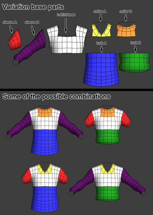
For example, all your sleeves have to work with all your torsos.
2: Make sure your topology around your deforming areas lines up to ensure that there will be no piercing of geometry.
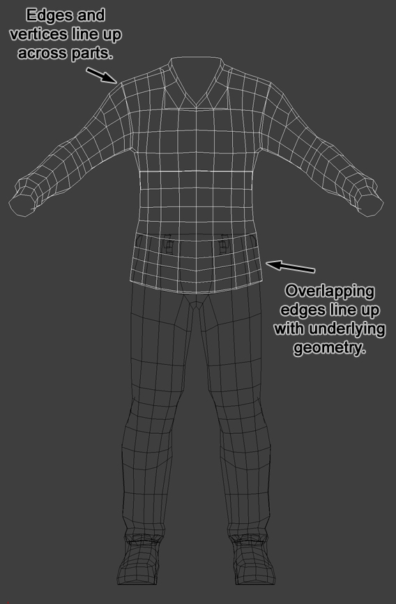
This should really be general knowledge when it comes to game modeling, but it's easy to overlook when making characters as complex as this. Be sure to test your parts across all your variation parts.
3: Keep your pivots at 0,0,0 across all parts.

This will ensure that all the parts snap together perfectly when snapped to 0,0,0, such as below:
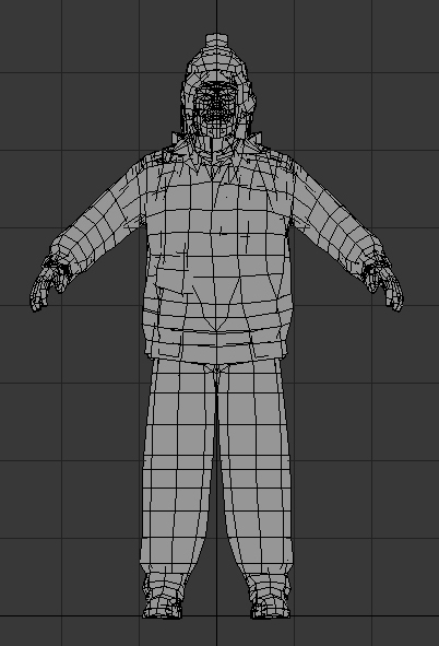
4:
Keep your naming convention easy to follow.
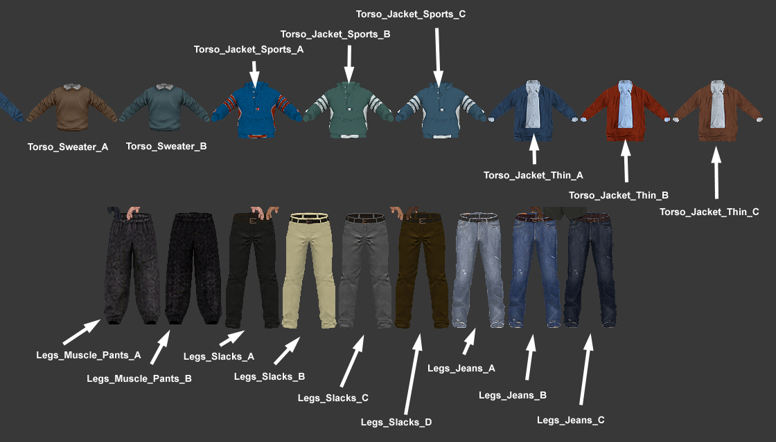
Be descriptive with the name. Identify left and right with _L and _R. If a model has similar multiple objects like toes or fingers use numbers.
For sorting purposes, I try and define the region first. This will ensure that all the parts will sort together alphabetically.
Regions can include the following:
- Head_
- Torso_
- Leg_
- Arm_
- Hand_
- Foot_
- Sleeve_
- Pants_
- etc.
The key is to be descriptive so selecting parts is easy for you.
Now Let's Look At How I Applied The Above To My Model
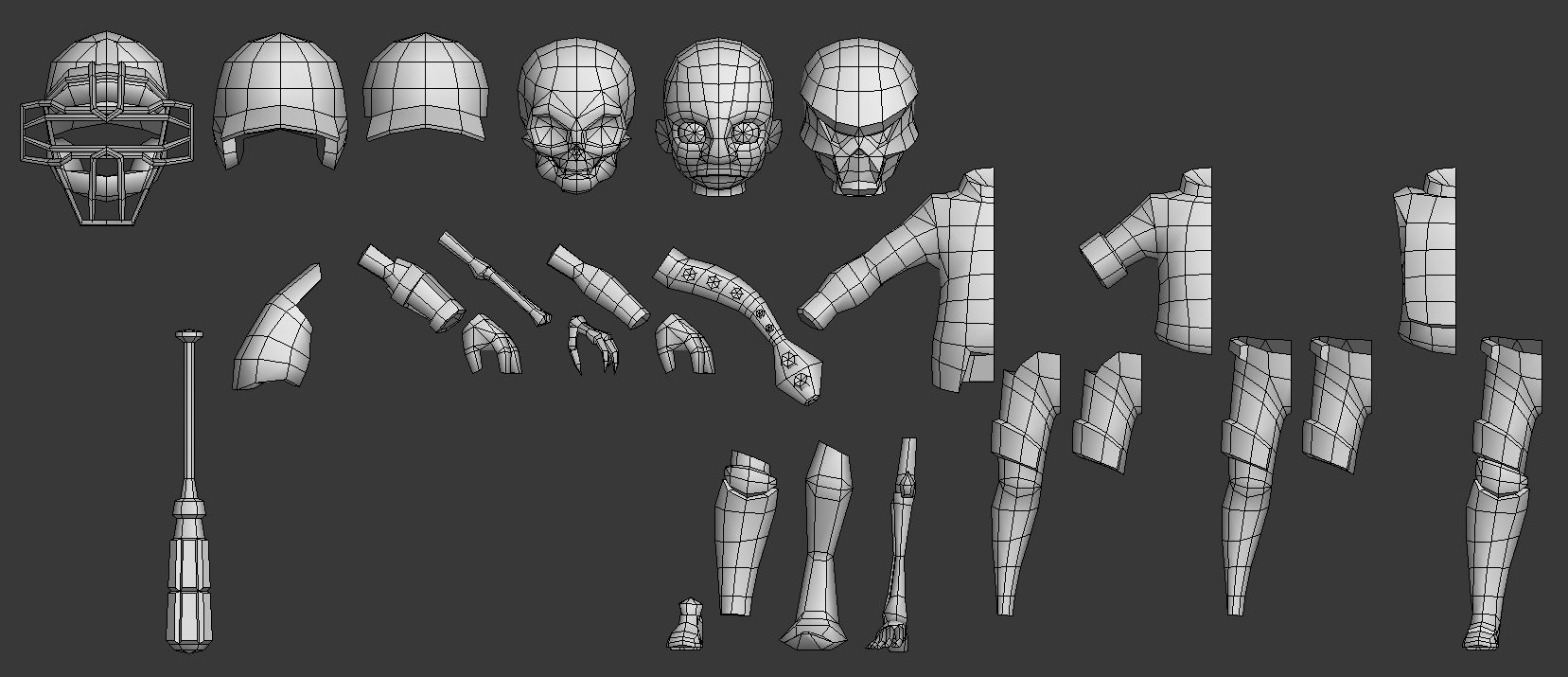
All parts have a pivot at 0,0,0.
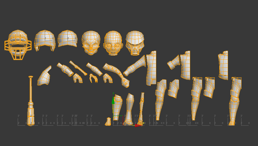
They all snap perfectly together at 0,0,0.
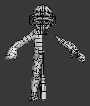
I followed a naming convention that makes sense for this file:

All verts snap perfectly across parts:
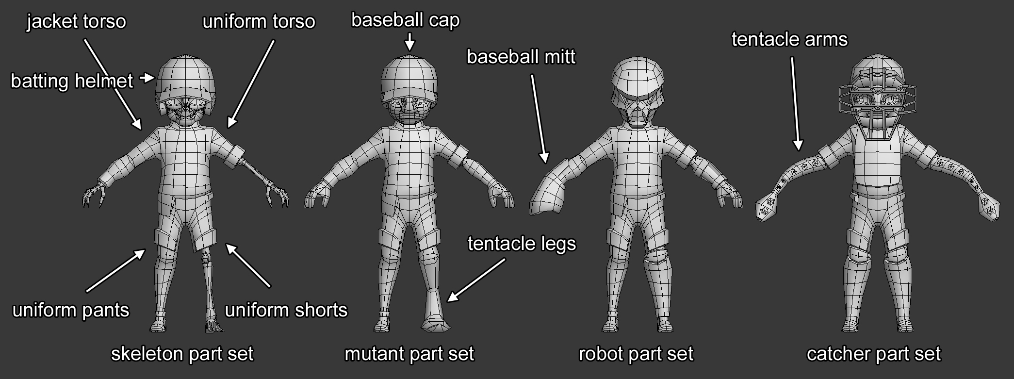
The above image shows some of the possible combinations available.
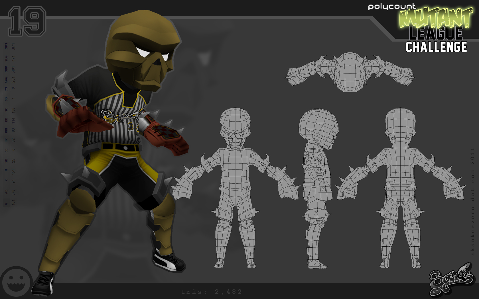
Parts like the caps don't fit perfectly just yet because I'm waiting until I begin creating the unique variations. There are two sets of torsos. A uniform one and one with a baseball jacket over the uniform. For the jacketed torso, I had to create a modified version of the pants and shorts to work with the overhanging jacket. The modified geometry will share the same uv texture space as the unmodified pants and shorts. The shorts are designed to be cut off at a natural seam that will be hidden be an armor plate and strap. There is still some geometry missing, such as spikes, eyes, baseball, and possibly another mutant head.
This is what I have so far
The next part will be over laying out the uvs and the beginnings of texturing. Also keep in mind, these are the base proportions. Once the models are uvmapped and textured, the process of reporportioning the 9 unique characters will begin. Some will be made fatter, others taller, some longer legs, others longer arms, etc.
I haven't been working on this as much as I should, or I would be further along. Been trying to balance this out with my social life. Either way, I should still hit the deadline.
I'll know for sure if I have to remove parts or if I can add parts during the uv phase.
More Info
I'm going to be uving these guys next and adding what geometry I'm missing all this week. Hopefully I'll be starting texturing this coming weekend.
Quote: Originally Posted by slipsius
Is that what you do in the end of it all? combine them and export? or do you export each piece and let the programmers randomize it some how?
For this challenge, I'll isolate variations and delete the excess. When I was at TRI, we would export the full model with all the parts out. We would randomize it in real time with an XML sheet that contained the rules for randomization. It was all naming convention based.
Quote:
Also, what kind of rigging issues do you run into? In one of your first examples, there were some variations of suspenders. Is that a pain in the ass to paint the weights for to have no clipping?
Usually there is very little issues when it comes to rigging. As long as I follow my rules then they should work just as well as any other characters. Suspenders aren't that big of an issue. The geometry has to mirror the geometry that's underneath them. It will lead to some crappy looking topology, but they will deform exactly like the torso.
Quote:
Also, Great first mutant* Whats the tri count on it?
Thanks! Each variation is roughly 2500. I'll make sure to optimize on the final models if I have to.
UV Mapping your parts
Once you've created your parts, it's time to uvmap them.
Follow whatever pipeline you are comfortable with. For this I'm using Headus UVLayout. I take all my parts and unfold them.
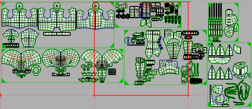
I then take them back into Max and check to make sure there isn't any distortion.
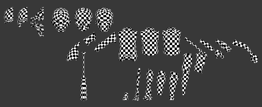
At this point, I take some time to go and model a couple more heads and body parts.
Now it's time to pack your uvs.
Packing your UVs
Before we begin packing our uvs, let's take a step back and think about how we want to lay them out.
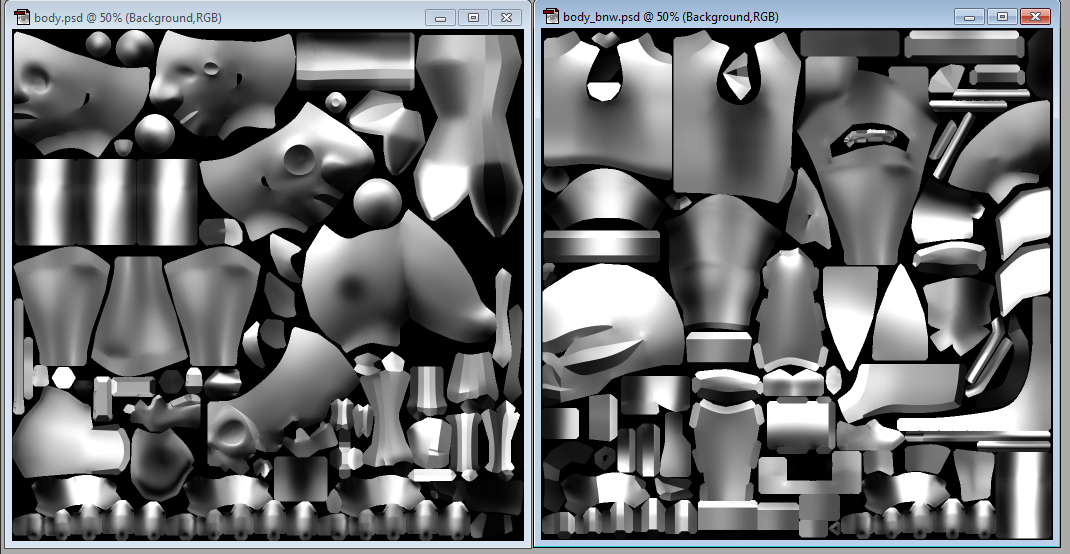
One thing most game artists don't know (especially character artists) is that every 32-bit texture is actually 4 grayscale textures.
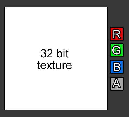
This means that with a single 512x512 you have the same amount of pixels as a 1024x1024 if you choose to texture your character only using grayscale. This is, of course, if your game's shader system allows you to use individual channels. I'm using Terminal Reality's Infernal Engine, and it lets you do just that.
For my model, I decided that I need full RGB for certain pieces of the model, but not all of it. So this means that I'm going to use the RGB channel to color those areas and the other areas will be mapped through the alpha channel.
My first step is to separate the geometry into the two groups and pack each group into it's own space.
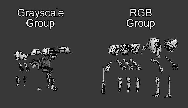
Each group should now have it's own set of uvs.
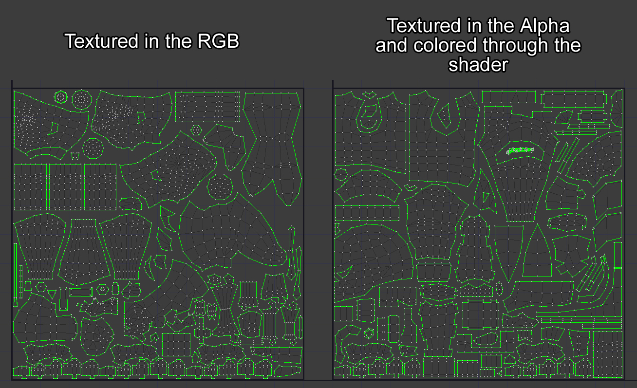
- Protip -
As I was packing the uvs, if it turned out I needed to scale the uv islands, I would collapse the stack, select both groups, and scale ALL the islands across both groups to keep the pixel density consistent across the entire model.
Once you have packed all your pieces, you're ready to move to the next step.
Preparing the Textures
We all have our own pipelines, but I thought I would give you guys a peek into mine. I won't break apart my pipeline as that can be saved for another time.
Here are some snapshots:
Baking lighting onto all the parts.
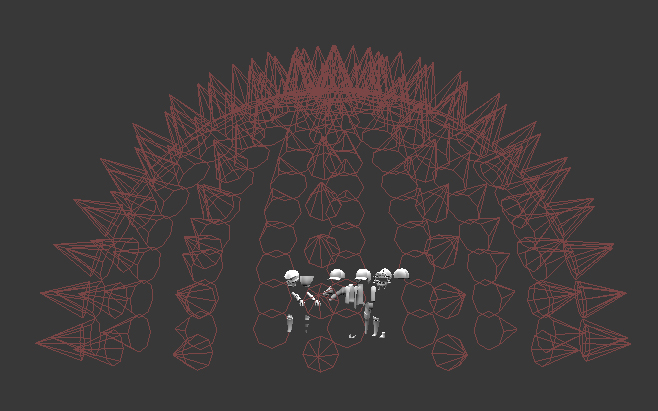
Taking all the parts and piecing together your unique characters.

Texture wip sneak peek:
Texturing
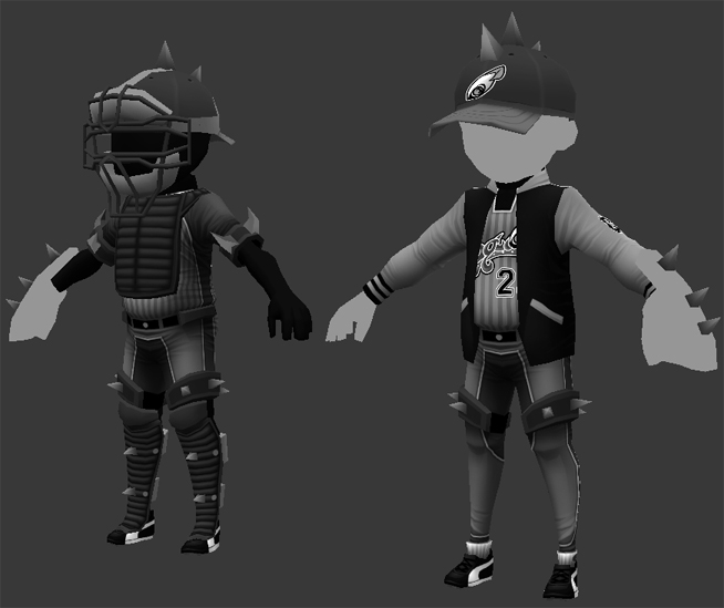
Finished texturing all 9 characters.
RGB and Alpha:
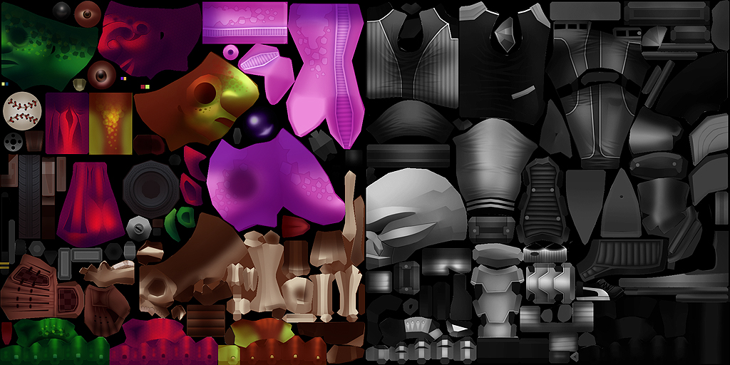
I'm texturing using my own style. I developed my style as a way to make my 3d models look like my illustrations. It is very illustrative. I do a majority of it with the polygon lasso tool and a couple taps of the airbrush. The above screens have no lighting in max.
Up next is playing with masks to color the uniforms.
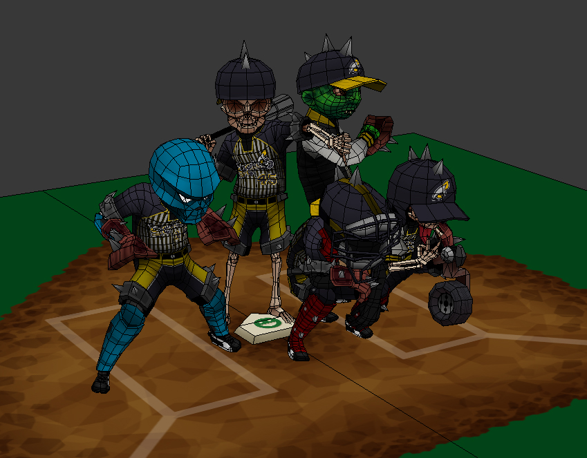
Also. Have to build a base for the group to stand on. I will also be building mock screenshots for 'menu selection' to show the characters within the context of the 'game'.
Q&A
Quote:
Right now most of it looks very grey. Did you do that on purpose so that in unreal or whatever, you just play with materials to add colour or what?
You are correct. A mask image will be used to apply color to the uniforms.
Quote:
Also, a little crit. Im personally not a fan of the shorts. Well, actually that's not true. I like the shorts, but I feel you need another variation thrown in there as well. They are all the same. Every other section of the body has variations, and it shows nicely when lined up. But when lined up, the shorts are clearly reused on EVERY model. Im sure it has something to do with the poly limits, but I feel that that is your room for improvement.
You're right too. I was going to give one of the robots pants, but then decided against it. So right now the two captains have the pants.
All these guys are modular, so in the end, I can add pants to whoever I want depending on the final pose.
Quote:
One thing though: In your colored Texture you are using a lot of one-colored objects (each island has a very dominant color). Wouldn't it have been more efficient to use Vertex Colors for these parts as well, allowing you to use 4 individual textures (each channel one) and therefore double the Texel-Density?
You're right. I'll go back in there and add more color to the shadows.
There were a couple parts that were going to be colored through the shader (like the skeleton bones), but in the end I didn't have enough room in the alpha for their uvs, so I put them into the rgb.
Quote:
OT but could you show the rig for this crowd?
If I get time to. The rig for that is in Maya, and I don't have access to that right now.
Quote:
I couldn't help but notice each of your players have a different number. Is there some shader magic here ?
Nope, just different uv coordinates. If I had a programmer with me and this was an actual game, the uv coordinates for the numbers would be the same and I would use a font for the number. For this competition though, I just had to fake it.
Thanks for all the feedback guys* Hopefully I'll have time to make this as awesome as I can.
Quote:
Its not so much the pants that I meant. Im talking about the top half of the legs. every character has those spikes around its legs, which make them all appear to be shorts? its the upper half that i think needs variation. cant wait to see this finished though. You've done an amazing job so far.
oh hmm. Yeah. not sure what to do about that at this point. The most that can be done is variation in the spikes.
One of the limitations when it comes to making a crowd system is not being able to fully customize each character as you want to. It's all about compromise.
I think the screenshot might have something to do with the repetitive feeling of the thigh spikes. When I rotate the model around to the front, its not so noticeable. I'm hoping when they're all posed and grouped together, it will just feel 'right' and bring them together as a team.
Quote:
nice work Jesse, how are you getting the resolution on the logos and numbers?
Hey Austin!
I'm using a mask image in which the R channel is the detail for the decals, and the A is the opacity for them.
I crammed 4 masks for uniform color in the G and using a 2d transform to stretch them out and offset them before piping color through them.
Then in the B channel, I have 4 more masks for the robots and the color for the logos. I use a 2d transform to stretch them out and pipe colors through them as well.
So basically the G and B channels hold 8 256x256 texture masks.
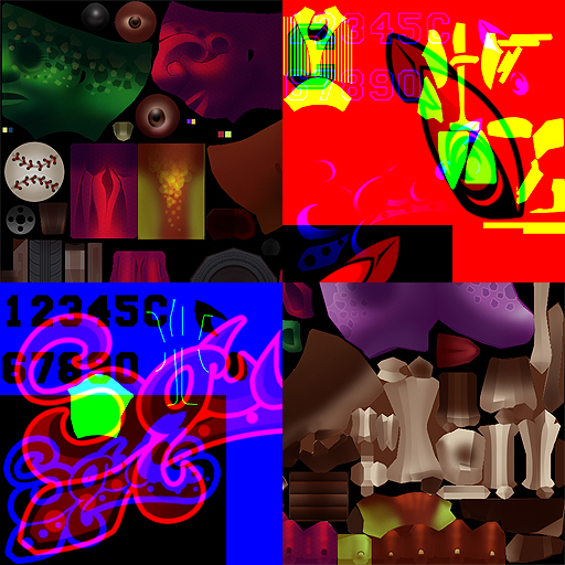
It's a complex shader as you can imagine, but there were no shader limitations in this challenge, so yay!
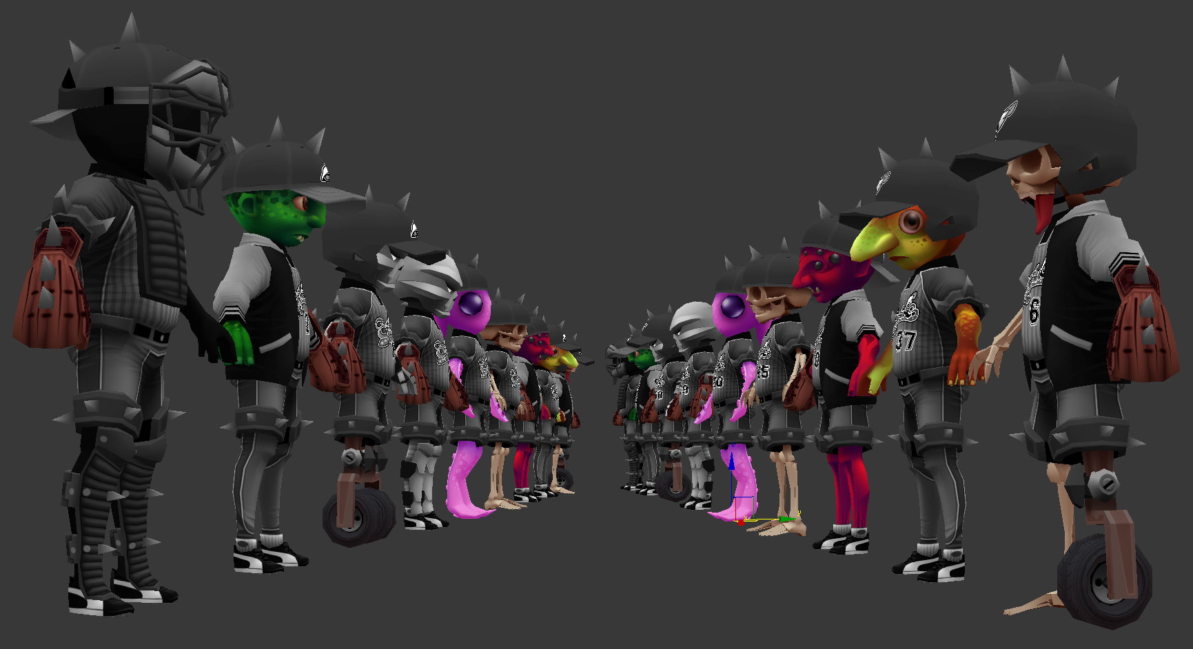
group shot wip
Results
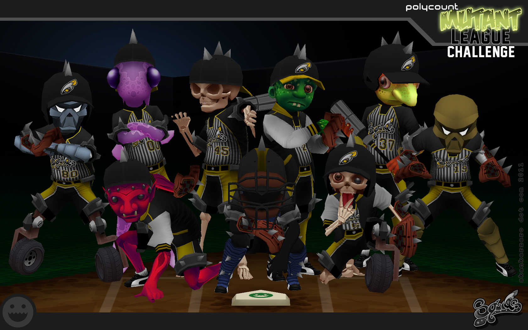
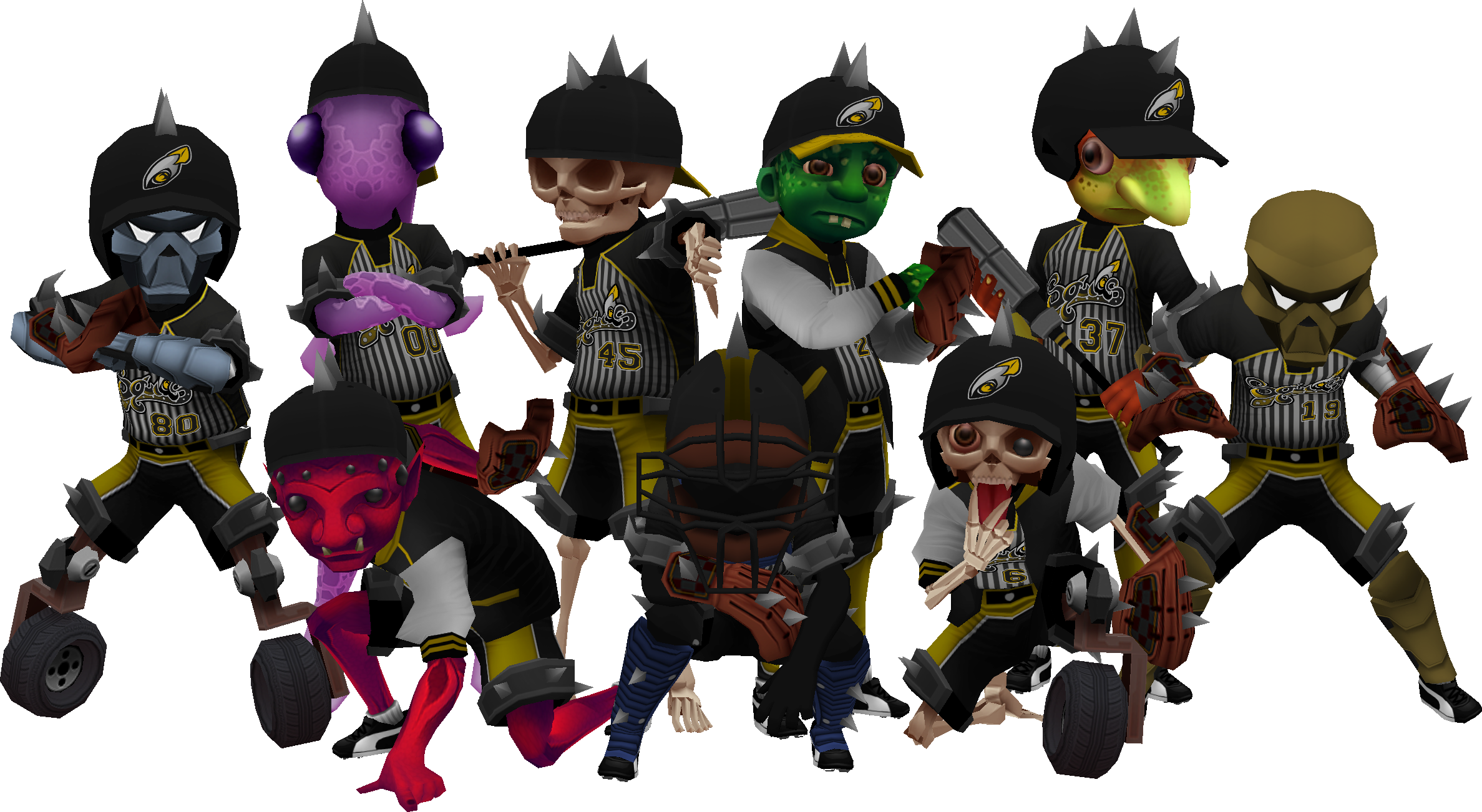
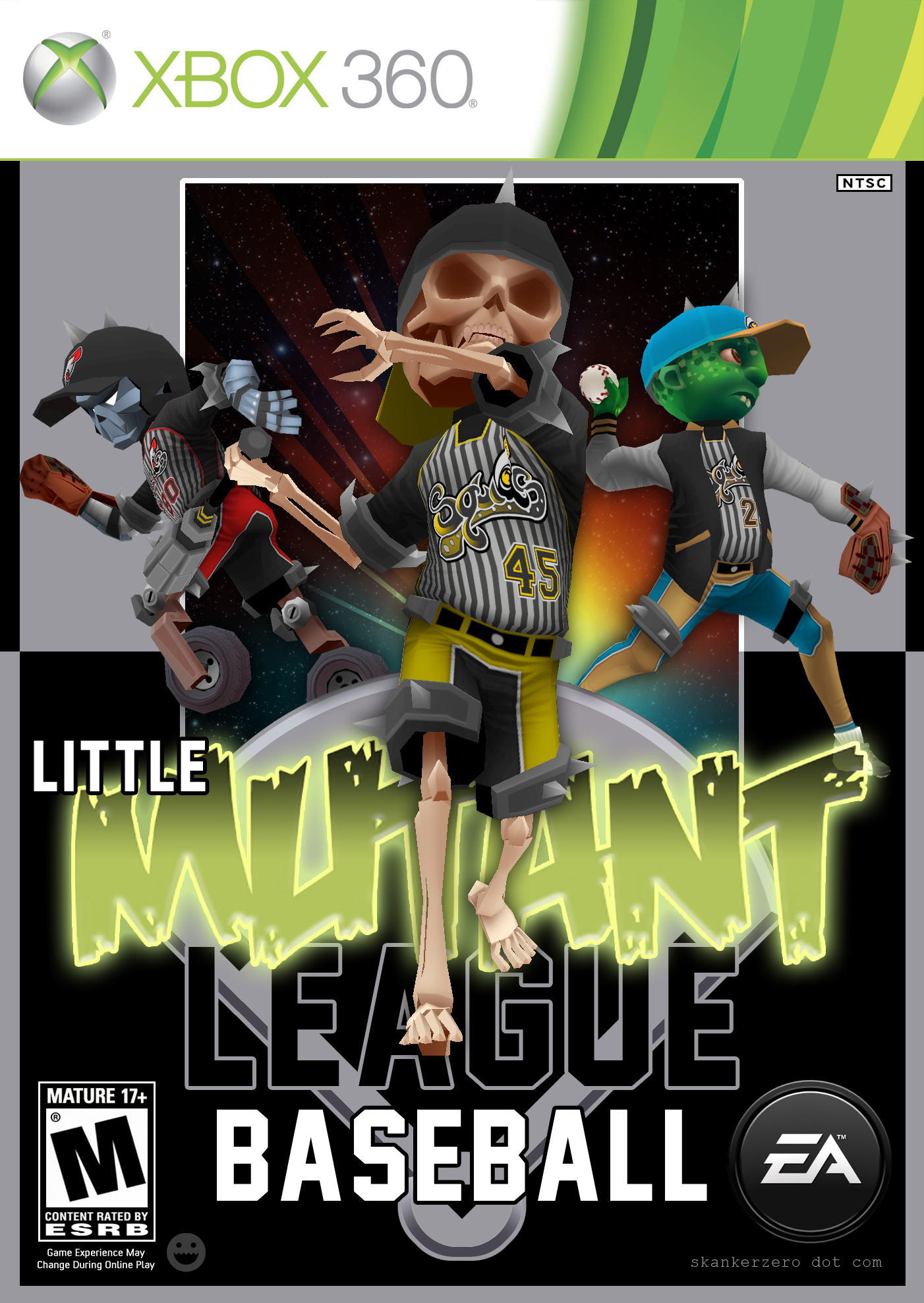

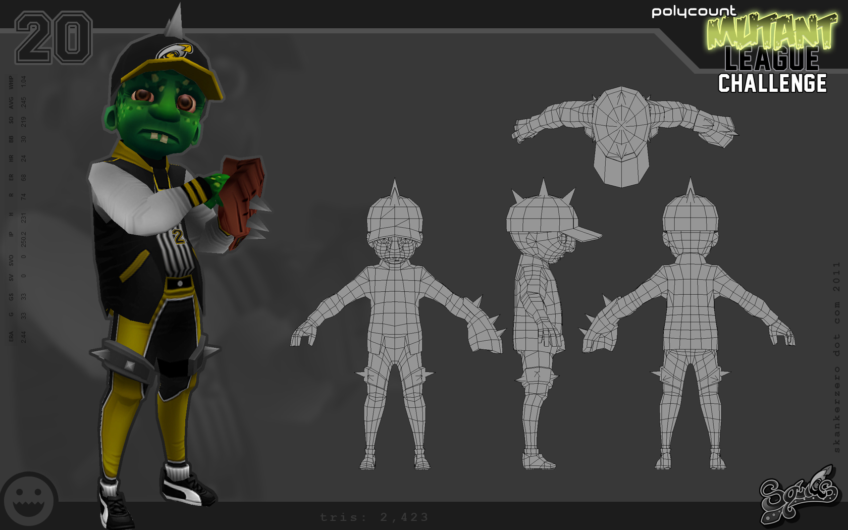
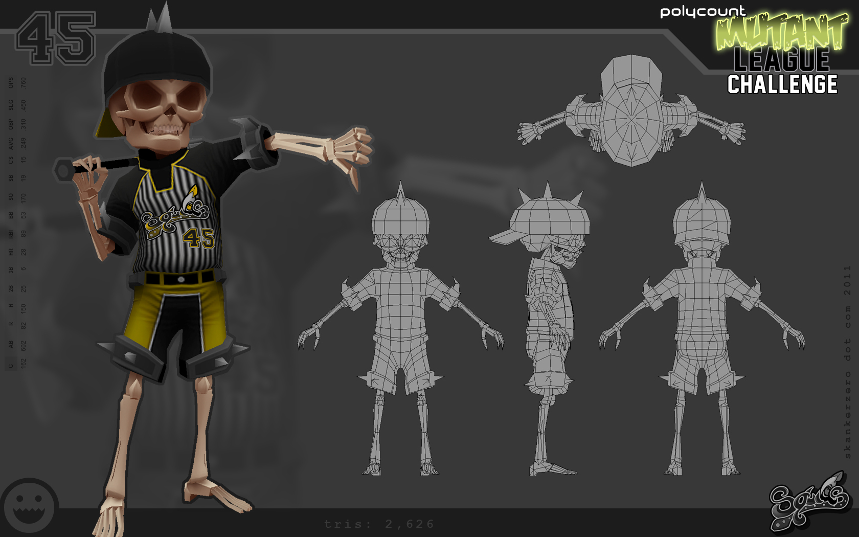
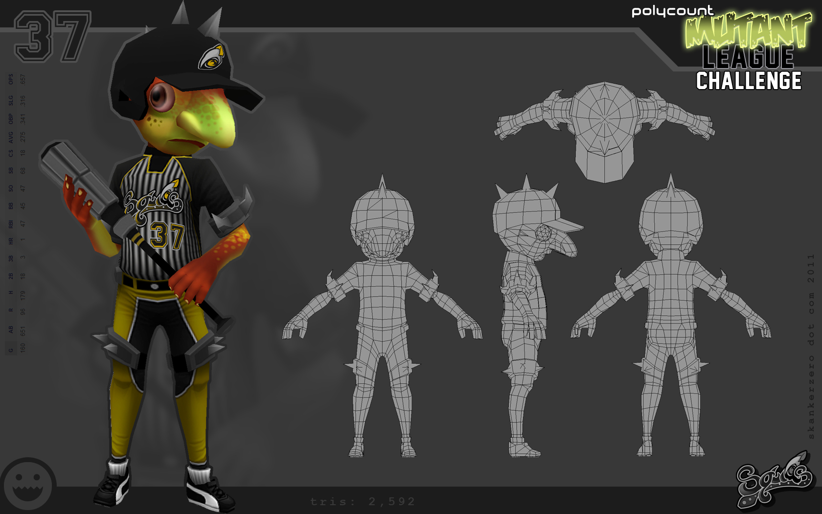
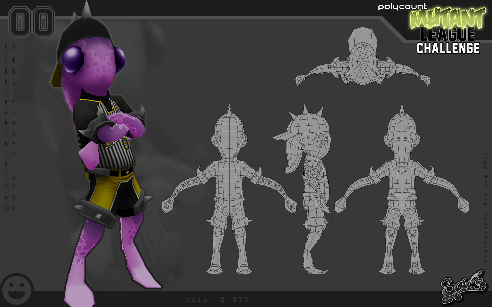
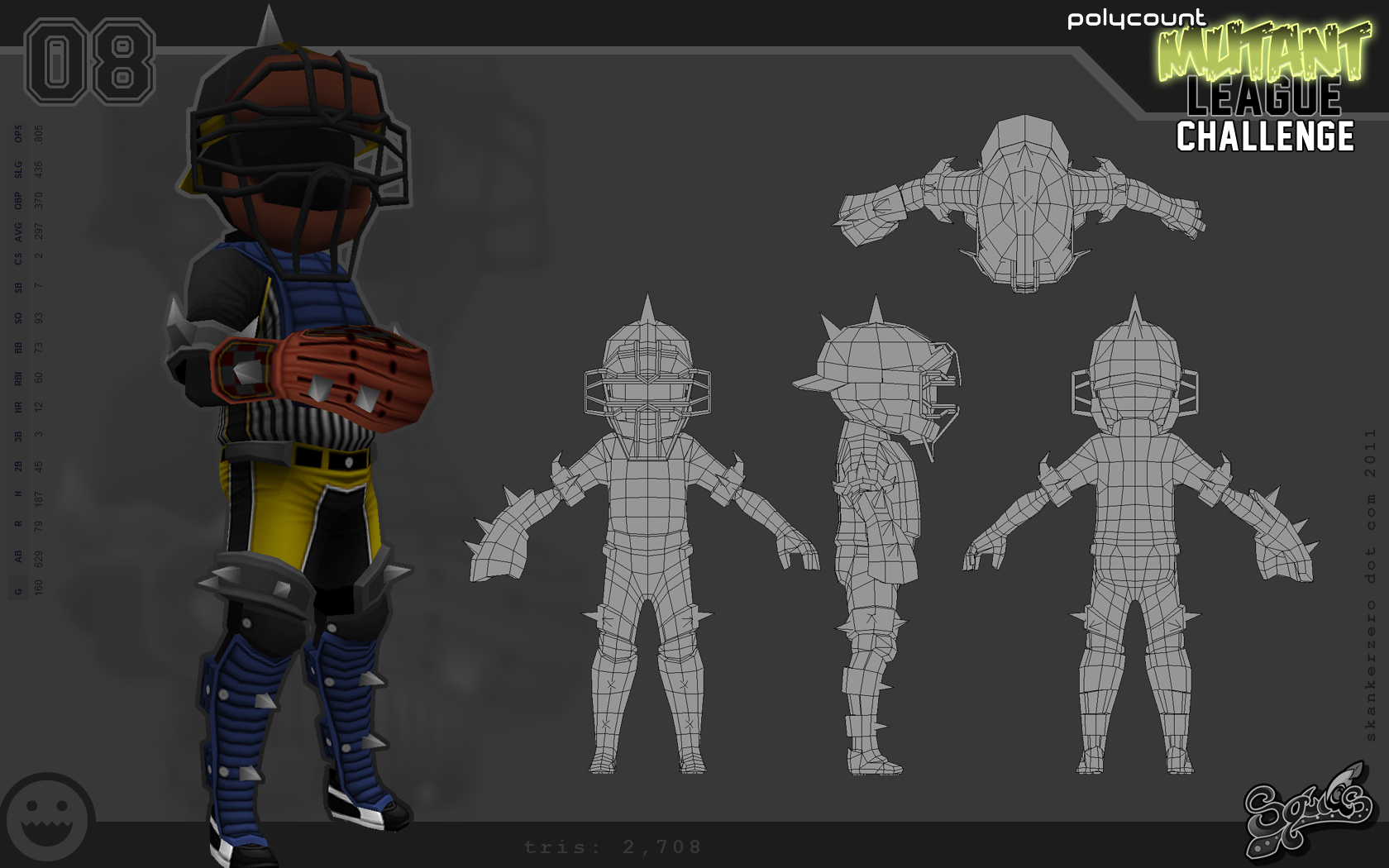
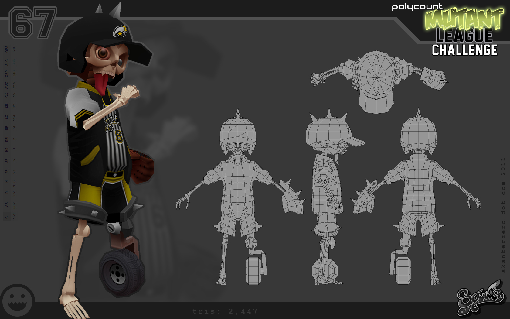
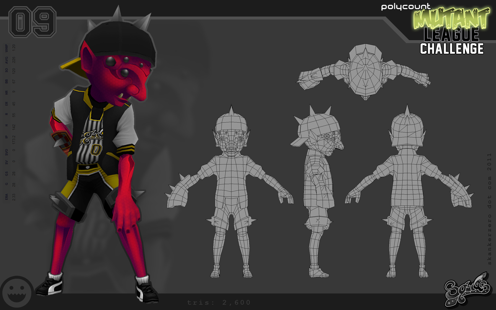
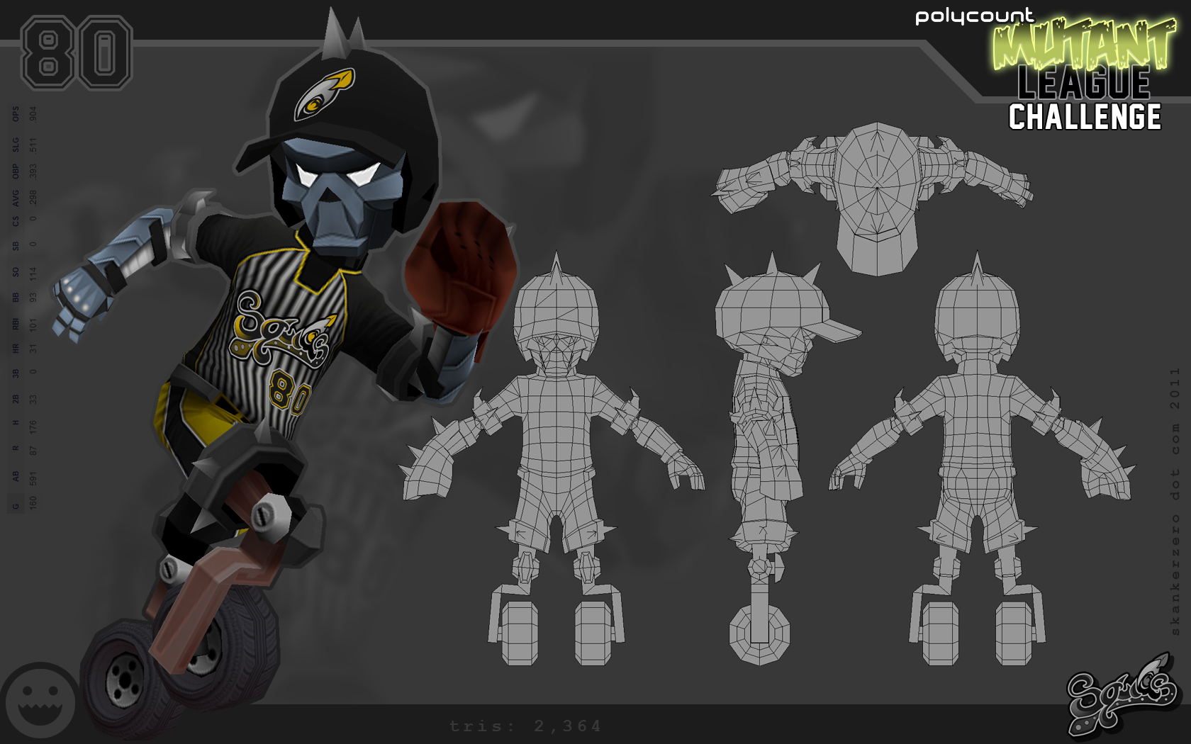
Individual character sheets:
