Difference between revisions of "Defining the Rift’s Visual Style"
EricChadwick (Talk | contribs) (added) |
(No difference)
|
Revision as of 18:10, 11 August 2015
Contents
Dev Blog: Defining the Rift’s Visual Style
BY RIOTOTOWN [1]
Working on the reimagined art style of Summoner’s Rift has been a rewarding, but not small, undertaking - we want to deliver a unique, timeless art style that remains relatable years after its creation. Our goal is to create a style independent of a particular time or place that retains the "inviting, magic-infused forest" vibe of Summoner's Rift. This means improving the style, cohesion & fidelity of the art while not being held back by technological constraints. Finally, the various aspects of this art style must all be aimed at clarifying gameplay in order to truly give players a more meaningful and immersive experience while playing League.
Timeless Style
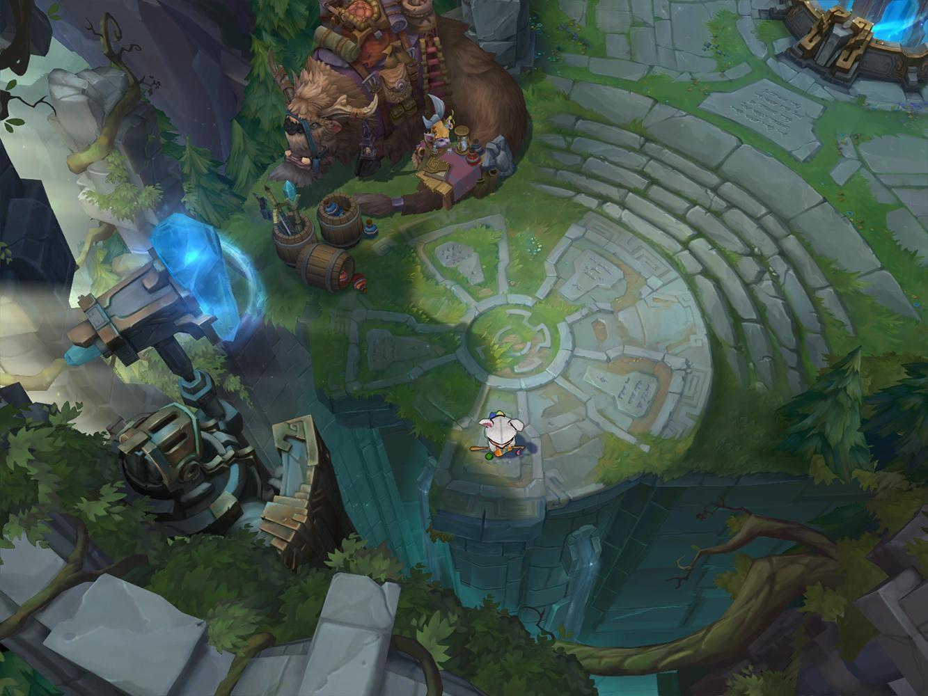
Timeless art has to have a uniquely recognizable style all its own, but must also be anchored in reality to be relatable. With that challenge in mind, we drew inspiration from our favorite games, works of art, and animated films in order to come up with the hand-painted, yet graphic style we developed while working on Summoner's Rift. We applied these inspirations to Summoner’s Rift in a variety of ways. Whimsical trees juxtaposed with more aggressive and stylized rocks; high contrast with soft, welcoming foliage and flowers abutted by sharp and cracked geological shapes. This pairing is key to the map’s shape language and extends similarly to the creatures living on the Rift, with a carefully balanced proportion of elements inspired from both reality and imagination. These dichotomies, along with the proportions, shape conventions, hues and values of the updated Rift all come together to create the "uniquely LoL" aesthetic we’ve been shooting for.
Thematic Cohesion
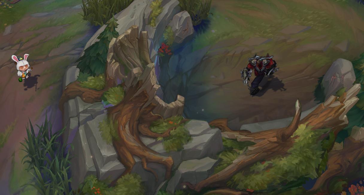
Creating a cohesive theme on the Rift requires all its art to refer back to a singular vision built through story, concept art, and real world reference. This creates consistency among the different elements within the environment and ensures that the things you see in game while playing actually belong together, establishing a more believable and immersive world. Even the scale of buildings and foliage has been addressed. We’re working to create a world where the various elements of the landscape all feel right at home next to champions’ style, scale and overall look. One of the main things we have to consider is that Summoner’s Rift is the canvas on which all of our champions must sit. The champion pool holds a broad spectrum of styles – from the whimsical nature of Teemo or Lulu, to the darker aggression of Nocturne or Zed. In order to ensure champions fit into the world, we have to blend the painterly baseline of the environment and monsters with more graphic elements that relate to the art of even the grittiest champions. This spectrum (from painted to graphic) is something we’ll continue to refine as we iterate on SR and League’s overall art style.
Increasing Clarity
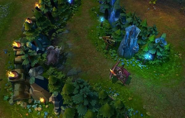
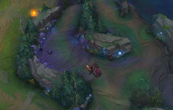
Increasing gameplay clarity is a primary focus when it comes to updating Summoner’s Rift. Clarity, for art, means creating art that minimizes visual clutter.
 |
|
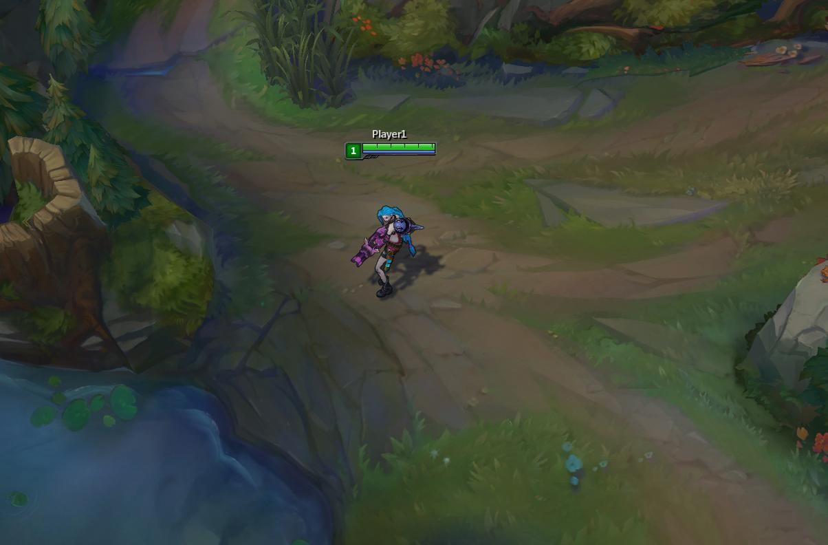
Quite simply, in every second of a game of League, we’re communicating a ton of information. So when we talk about working to improve clarity, we’re talking about improving the accuracy and usefulness of all of this information and enabling players to more easily digest what’s going on during gameplay. This means simplifying shapes and values to make for easy visual reads no matter where you are on the map or what you’re looking at. The map should always relate to the champions, but it also needs to sit behind and frame them clearly as players run around shooting off abilities in groups of up to 10 at a time.
Another concept we keep in mind when pursuing clarity is “flow” – essentially, the art should be a soft visual indicator that subtlety suggests the path. It should clarify game space, not clutter it. Applying visual design elements to make for readable paths should help players in understanding exactly where they are and where they’re going while navigating the Rift.
Visual Hierarchy
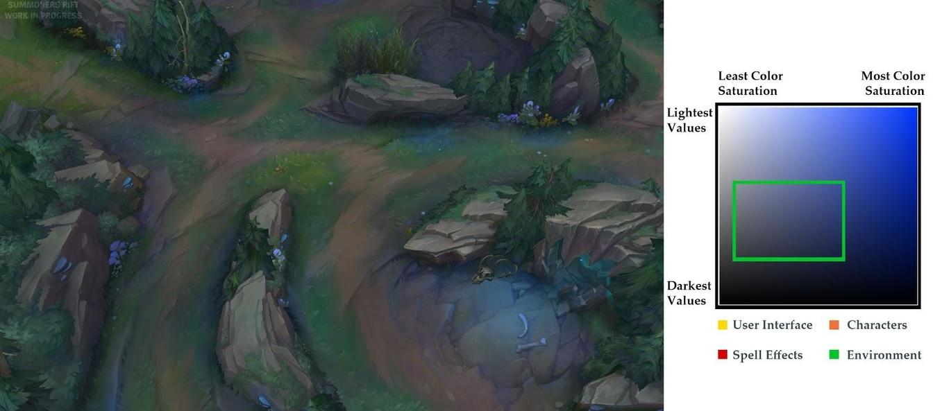
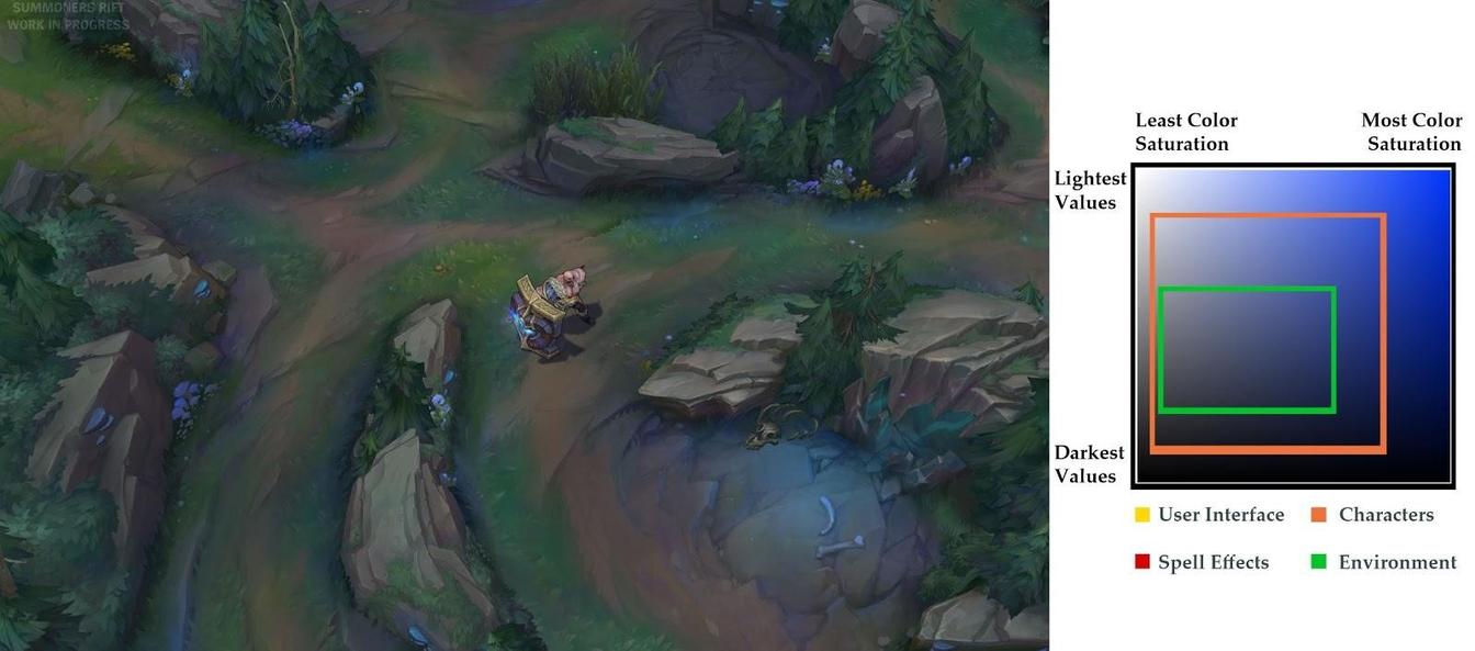
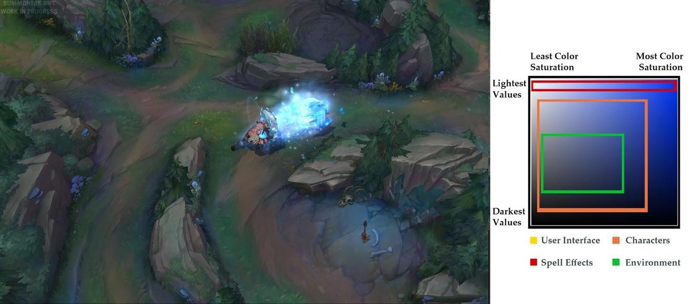
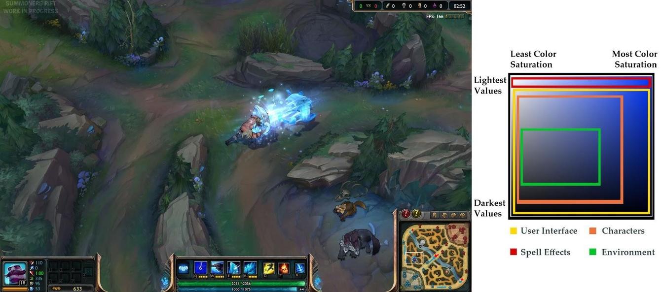
We also try to bring more clarity to players by looking at the overall map in layers, as a hierarchy of visual elements, which ties together a lot of the things we’ve discussed above. The images below take a look at this hierarchy, with the accompanying graphs displaying value saturation constraints for each layer.
First is the background which sits behind everything else and serves as a canvas for other elements.
On top of that are the characters, which are second in contrast and visibility so that they stand out from the background. Players need to always be able to clearly understand exactly where their champion (and others) are on the map.
Visual Effects come third, so that in the middle of a busy team fight you can clearly see when a Kog-Maw’s lobbing artillery at you or the Sion train is barreling your way.
Finally, the User Interface sits atop everything and is the easiest element to see. Although it sits on the top layer, it’s slim and small as possible to avoid obscuring gameplay.
Invisible Technology
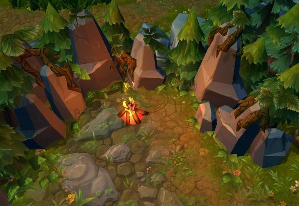
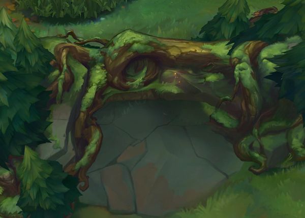
Last but not least among our goals is creating an art style without visible technology - things like hard polygon edges or crunchy, overly realistic textures. Thinking back to our favorite games from 5 or 10 years ago, most were using various forms of art technology that look almost archaic to us now. While we loved the vibe of these games, it's clear when looking back at the art that technology was often a limitation. Few games and movies successfully break this boundary, but it’s something we really aspire to with the Rift’s updated art style. Some big wins we get from building this way include a fully cohesive look and a unified, painted style across the entire map. We’ve limited ourselves to polygon budgets that would typically create very low-end looking, hard edges; however, the new art uses a technique in which painted elements define edges and hide the tech. Take a look at the evidence in the screenshot of the Golem pit comparison below:
 |
|
The old map uses visible tech – polygon edges stick out and date the visuals. The new version shows how we’re choosing what edges we like and using alpha-blending and hand-painted geometry to achieve the desired look. This technique can also be done on much “cheaper” geometry for video cards to render, allowing us to improve other map elements like visual effects or animated parts of the environment.
Looking Ahead
That’s it on the art for now! Looking ahead to open beta and beyond, we intend to continue adding polish to the updated map and eventually bring the artistic style of League of Legends to other parts of the game. Thanks, and we’ll see you on the Rift!
Retrieved from Dev Blog: Defining the Rift’s Visual Style
